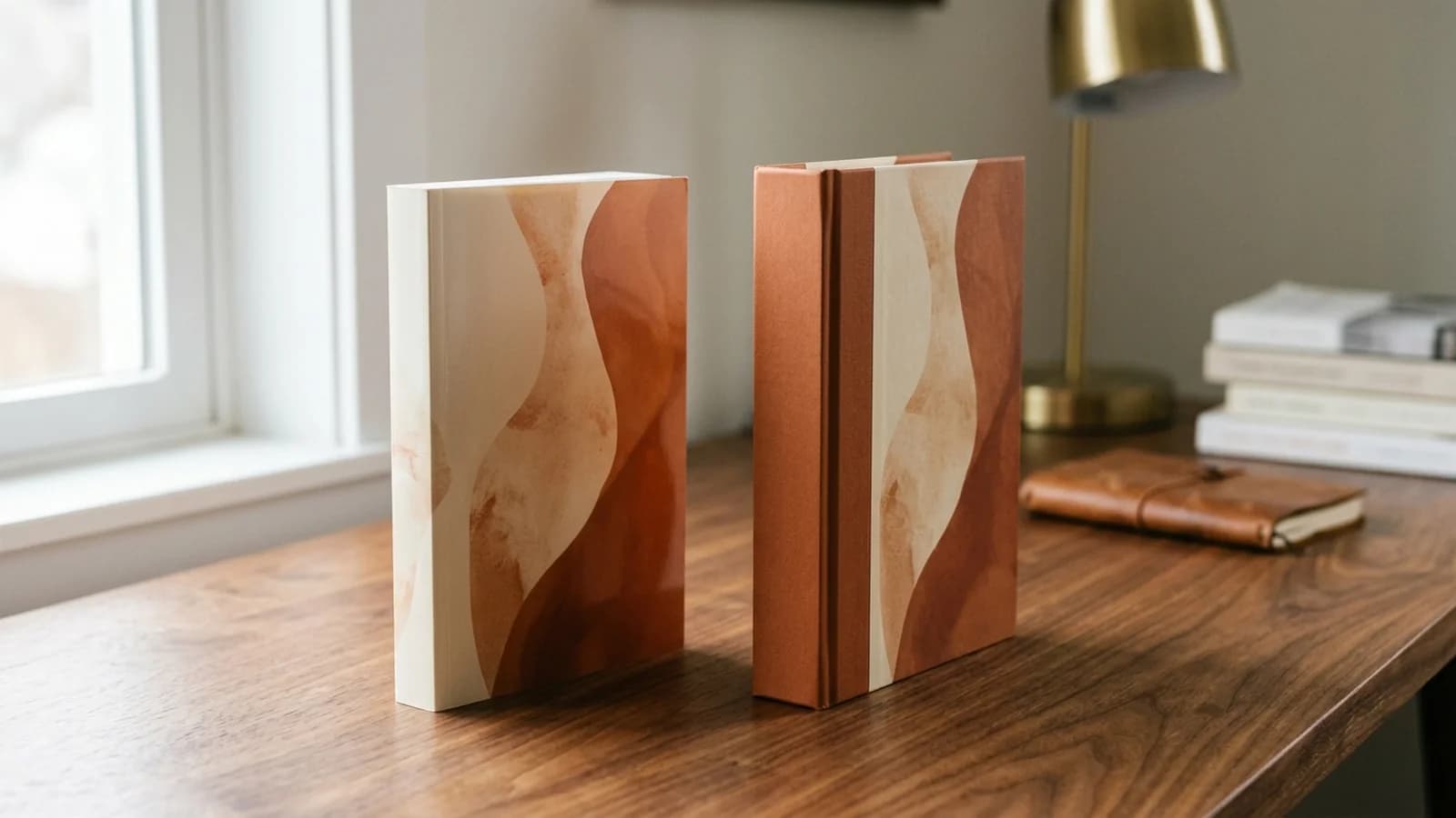

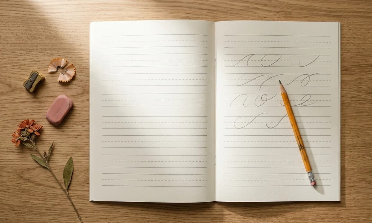
Handwriting practice books are one of the calmest, most predictable niches on KDP. The audience does not chase trends. A five year old learning lowercase letters this year will hand the workbook down to a four year old sibling next year, then a parent at the playgroup will see it and buy a copy. Reviews compound, school year and homeschool demand stack on top of summer learning demand, and a competently executed title can earn for half a decade. The catch is that the bar for "competent" is higher than it looks. Parents instantly spot wrong line heights, thin print, and filler pages. This guide breaks down exactly how to design, price, and launch handwriting workbooks in 2026 across every age band from toddler tracing to cursive mastery.
Why the handwriting niche stays profitable while other kids categories crowd out
The activity book and coloring book shelves have absorbed years of AI-flooded supply. Handwriting has not. Two reasons:
- Quality is visible at a glance. Parents can tell within three pages of the Look Inside preview whether the line conventions are right. Lazy uploads get filtered out by the buyer, not by Amazon.
- The skill is taught the same way every year. A 2018 first-grade handwriting workbook teaches the same letter forms as a 2026 one. Your book does not go stale the way a "social media trends" title does.
The downside: there is no "rising tide" lifting all titles. You have to earn placement with design that respects the way kids actually learn to write.
The four age bands. Pick one, build for it
Every successful handwriting workbook on KDP fits cleanly into one of four age bands. Mixing bands inside a single book is the single most common reason parents return them. A four year old does not need full sentences. A nine year old does not want to trace dotted uppercase A on 1 inch tall lines. Build one book per band, then graduate the child to the next in the series.
Ages 3 to 5: pre-writing and uppercase letter tracing
This is the entry rung. The child is just developing pencil control. Skip lowercase letters entirely. Focus on pre-writing strokes (vertical lines, horizontal lines, diagonals, circles, waves, zigzags), then graduate to uppercase letters A to Z. Uppercase comes first because the strokes are simpler: every letter starts at the top, goes down, and uses straight lines or single curves. Lowercase letters with their loops and stems wait for ages 5 to 7.
- Line height: 1 inch total writing space, with the baseline at 0.5 inch and a solid top line. No midline yet (lowercase comes later).
- Practice density: One uppercase letter per spread. Left page: large solo letter to color in. Right page: four to six rows of dashed tracing letters at 1 inch tall.
- Cover read: Bold "Ages 3 to 5" pill, friendly illustration, one accent color. Parents are buying for the youngest writer in the house.
- Price: $5.99 to $7.99 for 80 to 100 pages.
Ages 5 to 7: lowercase letters, sight words, short sentences
This is the largest segment by sales volume. Every K through second grader is working on lowercase letter formation and the first two or three sight word lists. Build the book to mirror what kids see at school: lowercase introduction, then short consonant-vowel-consonant words (cat, dog, sit, run), then very short sentences (I see a cat).
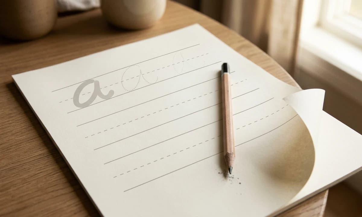
- Line height: 0.75 inch with a solid top line, dashed midline at 0.375 inch, solid baseline, plus 0.2 inch descender space.
- Practice density: Four to six rows per lowercase letter, three rows per CVC word, two to three rows per short sentence. Mix in review pages every fifteen pages.
- Sight word lists: Use Dolch Pre-Primer and Primer or Fry first hundred. They are not copyrighted and parents recognize them by name.
- Price: $6.99 to $8.99 for 100 to 120 pages.
Ages 7 to 9: full sentences in print and an introduction to cursive
By age seven most kids have print down. The growth area is sentence-level writing and the start of cursive. This band is where parents become highly engaged buyers. Cursive is not taught in many public schools anymore, so parents and homeschoolers actively shop for it. Two strong book concepts live here:
- Print sentence and copywork book: Famous quotes, classic short poems, kid-friendly facts. Three rows per sentence on 0.6 inch lines.
- Cursive introduction book: Individual cursive lowercase letters with arrows showing entry and exit strokes, then letter pairs, then short words. Use a 15 to 20 degree slant guide as a light dotted overlay.
Price both at $7.99 to $9.99 for 100 to 120 pages.
Ages 10 plus: cursive mastery and stylistic refinement
The smallest band by volume, the highest in margin per sale. Buyers here are often homeschool families, classical educators, or older kids self-correcting bad handwriting habits. Content options:
- Full cursive workbook: All twenty-six letters, all connections, paragraphs, and a free writing section.
- Themed cursive copywork: Bible verses, classical poetry (Frost, Dickinson, Longfellow are public domain), Shakespeare excerpts, Scripture, or famous speeches.
- Italic cursive specialty: A growing classical homeschool segment. Lower competition, loyal buyers.
Price at $8.99 to $10.99. Themed cursive workbooks for adults learning calligraphy can stretch even higher, but that is a different audience and a different cover style.
Lay out your age-band series the right way
Generate parent-trustable handwriting workbook covers in minutes. Clean age pills, calm palettes, and KDP-ready spine and bleed dimensions handled.
Start freeLine conventions: the part most publishers get wrong
A handwriting workbook is essentially a typeset grid system. Get the lines right and the book reads as professional even with simple illustrations. Get them wrong and no cover can save it.
The three-line guide (also called the Zaner-Bloser or D'Nealian style)
Each writing row needs three horizontal guides plus reserved descender space:
- Top line (solid, 1pt, 50 percent grey): Caps uppercase letters and tall lowercase letters like b, d, h, k, l, t.
- Midline (dashed, 0.5pt, 50 percent grey): Caps short lowercase letters like a, c, e, m, n, o.
- Baseline (solid, 1pt, 50 percent grey): The line every letter sits on. This is the only line that should be slightly darker.
- Descender room (no line, 30 percent of row height): Below the baseline. Reserved space for g, j, p, q, y. Skipping this is a tell-tale sign of an amateur upload.
At 8.5 by 11 inches, a 0.75 inch line height with 0.625 inch margins gives you roughly twelve rows per page, which is the comfortable industry standard for the ages 5 to 7 band.
Why grey lines, not black
Black lines at full opacity compete visually with the child's pencil strokes. The line should guide, not dominate. Print every guide line in 50 percent K (cyan magenta yellow black at 0/0/0/50). It still prints crisply on KDP white paper but does not overwhelm the actual handwriting. Test this on a proof copy before publishing. Online previews under-represent how dark lines actually print.
Line thickness rules for KDP
Anything under 0.5pt will print weakly or inconsistently on KDP's print-on-demand presses. Use 1pt for solid lines, 0.5pt for dashed midlines. For descender hash marks or stroke direction arrows, 0.75pt is the floor.
Paper choice and how it affects pencil and marker behavior
Print-on-demand quality matters more in handwriting than in any other kids category, because the child is going to write on the page with a pencil. The paper has to take graphite cleanly without smudging or denting.
Paper selection for handwriting workbooks
- KDP white 60 lb (recommended): Best contrast for grey trace letters. Takes pencil cleanly. Does not show pencil smudges through to the back. This is the default for all four age bands.
- KDP cream 55 lb: Lower contrast for traced letters. Pencil looks slightly muddy. Use only if your concept is a journaling crossover (cursive copywork for adults, calligraphy practice).
- KDP premium color 60 lb: Only justified if your interior actually prints color. Most handwriting books should not. Adds cost without benefit.
One real-world note: KDP cream paper can dent slightly under heavy pencil pressure from a five year old. White 60 lb resists this better. If a child writes hard, switch to white.
Cover conventions that signal "this is a real workbook"
The cover sells the book before any line convention matters. Parents shopping the educational shelf use covers to filter quickly. Successful handwriting covers share five traits.
- Large, calm title in a single readable typeface. Sans-serif (Montserrat, Poppins, Nunito) or rounded slab (Recoleta, Fraunces) both work. Avoid script for the title itself; ironically it makes the book look less professional in thumbnail.
- Age band on its own line. "Ages 5 to 7" or "Grade 1 and 2". Use both formats in subtitle to catch both search phrasings. The age band is the single highest converting cover element.
- One focal illustration. Either a friendly animal mascot, a kid holding a pencil (no faces if you generate with AI, use back-of-head or side composition), or themed art tied to the interior (dinosaurs, ocean, holiday).
- Calm, parent-trustable palette. Cream and one accent, or two soft tones plus white. Avoid neon, glitter graphics, or cartoony candy-color overload. Those signal low quality on educational shelves.
- One credibility cue. "120 pages of practice", "Includes sight words", "Lowercase and uppercase". A single subtitle bullet does the work of a dozen reviews.
For the cover layout itself, KDP's cover calculator is the source of truth on spine width, bleed, and trim. See our full KDP cover requirements checklist for the exact dimensions, and for cover psychology specifically on educational and children's shelves, our kids picture books guide walks through the parallel rules for picture book covers.
Themes that outperform plain alphabet
A "Handwriting Practice Workbook Ages 5 to 7" with a generic ABC cover competes against thousands of identical listings. The same interior wrapped in a themed cover earns thirty to fifty percent higher click through and converts better because it answers a specific intent the parent has in mind. The strongest theme categories in 2026:
- Animal alphabet (A is for Antelope): Highest mass-market appeal. Pair each letter with a friendly illustrated animal on the facing page. Strong fit for ages 3 to 5 and 5 to 7.
- Name tracing books: A single book covering the top one hundred US first names with personal practice rows per name. Parents buying for a child whose name is on the list convert at much higher rates than generic tracing books.
- Holiday and seasonal: Halloween, Christmas, Easter, Valentine's, Thanksgiving. Sell heavily in the four weeks before the holiday. Build a five-book holiday series.
- Faith-based and Bible verse copywork: Short Scripture passages on three-line guides. Lower competition. Premium pricing. Loyal repeat audience.
- Sight word practice tied to Dolch or Fry lists: Search-friendly. Parents look for these by name because teachers send them home.
- Themed copywork (dinosaurs, space, ocean animals, knights, ballet): One short paragraph per page with three rows of guided practice. Strong for ages 7 to 9.
- Bilingual handwriting (Spanish-English, French-English): Very low competition. Parallel words on the same row. Premium pricing at $9.99 plus.
Pricing the shelf
Pricing on handwriting workbooks is tight. The buyer expects to see $5.99 to $8.99 in the search grid. Stepping outside that range, in either direction, costs sales. Below the table is the actual royalty math.
| Book type | Page count | List price | KDP royalty (US, expanded) |
|---|---|---|---|
| Pre-writing strokes, ages 3 to 5 | 80 to 100 pages | $5.99 to $7.99 | $2.20 to $3.00 |
| Uppercase letter tracing, ages 3 to 5 | 80 to 100 pages | $6.99 to $8.99 | $2.80 to $3.50 |
| Lowercase plus sight words, ages 5 to 7 | 100 to 120 pages | $6.99 to $8.99 | $3.00 to $3.85 |
| Sentence print plus cursive intro, ages 7 to 9 | 100 to 120 pages | $7.99 to $9.99 | $3.50 to $4.20 |
| Cursive mastery, ages 10 plus | 100 to 120 pages | $8.99 to $10.99 | $3.85 to $4.55 |
| Themed (Bible, animals, holiday) | 100 to 120 pages | $8.99 to $10.99 | $3.85 to $4.55 |
Royalty math assumes the 60 percent royalty option for expanded distribution at the chosen price minus the per-page print cost (roughly $0.012 per black and white page at 8.5 by 11 inches in 2026). For more on shelf pricing strategy across kids categories, see our pricing breakdown for kids titles.
Series strategy: where the real income lives
A single handwriting workbook can earn $30 to $80 a month at month six. A coherent four-book series can earn $300 to $800 a month, because Amazon cross-promotes within the series, reviews compound across titles, and parents who liked book 1 buy book 2 a year later without doing any new research. Build the series intentionally.
The ladder model
- Book 1: Ages 3 to 5 pre-writing and uppercase
- Book 2: Ages 5 to 7 lowercase plus sight words
- Book 3: Ages 7 to 9 sentences plus cursive intro
- Book 4: Ages 10 plus cursive mastery
The themed-grid model
For a faster compounding portfolio, build the same age band across several themes:
- Ages 5 to 7 animal alphabet
- Ages 5 to 7 dinosaur sight words
- Ages 5 to 7 Halloween handwriting
- Ages 5 to 7 Christmas handwriting
- Ages 5 to 7 Bible verse copywork
Each shares the same interior line system. Only the illustrations and word lists change. After the first book, each new title takes a fraction of the time. For more on cohesive series design, see our guide on series cover systems.
AMS and backend keyword strategy
Amazon Ads on handwriting workbooks works because the audience searches with high intent. A parent typing "kindergarten handwriting workbook" is not browsing. They are ready to buy. Your job is to make sure your title shows up.
Keyword tiers
- Tier 1 - exact intent: "handwriting practice book ages 5-7", "cursive workbook for kids", "kindergarten handwriting workbook", "letter tracing book toddler", "sight word practice book"
- Tier 2 - grade aliases: "first grade handwriting", "pre k handwriting practice", "grade 2 cursive workbook", "homeschool handwriting curriculum"
- Tier 3 - theme modifiers: "animal alphabet tracing", "Bible verse handwriting kids", "dinosaur handwriting practice", "name tracing workbook"
- Tier 4 - product modifiers (backend only): "120 pages", "large print", "thick lines", "spiral bound style", "reusable"
Run Tier 1 and 2 as exact and phrase match. Run Tier 3 as broad. Never bid on Tier 4 (those go in the backend search terms field). Full keyword research method including reverse ASIN lookup is in our KDP keyword research guide, and there is a dedicated walkthrough of AMS keyword strategy here.
The seven-line title formula that converts
A handwriting workbook title gets at most seven concept slots. Use every one. The pattern that wins on US shelves in 2026:
- Primary skill (Handwriting Practice / Letter Tracing / Cursive Workbook)
- Age band in both formats (Ages 5 to 7 - Grade 1 and 2)
- Format anchor (Workbook / Practice Book)
- Theme or specific content (Sight Words / Animal Alphabet / Bible Verses)
- Practice quantity (100 Pages of Practice / Over 80 Tracing Activities)
- Style cue (Print / Cursive / Italic)
- Bonus credibility (Includes Pencil Grip Guide / With Certificate)
Front matter that signals quality
Most handwriting workbooks skip front matter. That is exactly the gap to exploit. Two or three well-designed front pages flip the book from "another tracing book" to "real curriculum". Include:
- How to use this book: One page directed at the parent or teacher. Three short paragraphs on age expectations, session length (10 to 15 minutes), and how to praise progress.
- Pencil grip and posture page: One illustrated page showing the correct tripod grip and a calm seated posture. Parents notice and reference this page.
- Skills checklist: A page parents can mark off as the child completes each letter or skill. Drives ratings up because parents feel ownership.
- Certificate of completion: Last page. Personalized blank ("This certifies that ____ has completed..."). Parents post photos to social, which generates organic discovery.
Common KDP rejection and quality flags
Handwriting workbooks are rarely rejected outright by KDP, but they do get held in review. The most common triggers:
- Lines too thin (under 0.25pt). KDP flags this as a print quality risk. Use 1pt solid and 0.5pt dashed minimum.
- Cover bleed missing. 0.125 inch on all four sides for paperback. Use KDP's cover template.
- Cover image resolution below 300 DPI. A common AI-generated cover failure. See our guide on fixing blurry KDP covers.
- Misleading subtitle. Claiming "Common Core aligned" or "Certified by [organization]" without rights gets the listing held.
- Copyrighted character on cover or interior. Even a generic looking cartoon character can trigger a brand match. Use original or licensed illustrations only.
Skip the cover-design rabbit hole
Generate parent-trustable handwriting workbook covers with the right age pill, calm palette, and print-ready bleed. Series-friendly templates included.
Generate a cover freeTrim size, bleed, and interior PDF specs
Final checklist for the print file itself:
- Trim size: 8.5 by 11 inches. Standard US workbook size, only choice for the educational shelf.
- Margins: 0.625 inch outside, 0.5 inch top and bottom, 0.75 inch inside (gutter compensation for binding).
- Bleed: Not strictly required on interior pages with white backgrounds, but if you use any colored borders or background fills add 0.125 inch bleed.
- Resolution: 300 DPI on all images and traced letters. Vector traced letters at 100 percent zoom is ideal.
- Color profile: Grayscale for black and white interiors. CMYK for color (rare in handwriting books).
- File format: PDF/X-1a or PDF/X-4 with embedded fonts.
For a full breakdown of how trim size affects pricing and shelf placement, see our KDP trim sizes guide. For the relationship between page count and royalty (especially important on 100 plus page workbooks), the KDP royalty calculator gives exact per-sale numbers.
14-day launch plan
- Day 1: Choose age band and theme. Audit top twenty competitors in that exact band. Note line height, page count, cover style, and pricing.
- Day 2: Build the master line template in InDesign, Affinity Publisher, or Canva. 0.75 inch row height with three-line guide. Save as reusable master.
- Day 3 to 4: Generate all letter or word practice pages. Four to six rows per letter, three rows per word.
- Day 5: Build front matter: how-to page, pencil grip page, skills checklist.
- Day 6: Build review pages every fifteen pages plus the certificate at the back.
- Day 7: Final interior proof in PDF. Check line weights at actual print size.
- Day 8 to 9: Design the cover. Run two variations to A/B test in the first month.
- Day 10: Order a physical proof from KDP. Critical step. Online preview lies about line weight.
- Day 11: Hold the proof while you finalize backend keywords, A plus content, and listing copy.
- Day 12: Adjustments from the proof. Lines too light? Bump grey from 50 to 60 percent K. Letters too small? Increase by one point and reflow.
- Day 13: Upload final files. Set list price. Enroll in KDP Select if exclusive Amazon strategy.
- Day 14: Launch with a $5 to $10 a day AMS campaign on Tier 1 keywords. Hold the campaign for thirty days before optimization.
The honest take
Handwriting practice books reward patience and respect for craft. There is no overnight breakout title. What there is, reliably, is a category where competent execution earns more than clever marketing. Build a single book to the standards above and it will earn for three to five years. Build a four-book age-band series and you compound that into real income. Skip the rules on line conventions, age targeting, or cover credibility and the book disappears under the weight of better-built competitors.
The next two natural steps in the kids non-fiction shelf: our preschool workbook design playbook for ages 3 to 5 multi-skill workbooks, and our kids activity book guide for the variety-puzzle and game-style books that pair well with handwriting in a parent's cart.
A FEW MORE ANSWERS
Frequently asked questions
Use four clear age bands. Ages 3 to 5 covers pre-writing strokes and uppercase letter tracing on 1 inch tall lines. Ages 5 to 7 covers lowercase letters and short words on 0.75 inch lines. Ages 7 to 9 covers full sentences in print plus an introduction to cursive on 0.5 to 0.6 inch lines. Ages 10 plus covers cursive mastery and stylistic refinement on 0.4 to 0.5 inch lines. Each band is a separate book, not a chapter, because parents shop by age.

ABOUT THE AUTHOR
Danielle Okonkwo
Marketing & Growth Lead at KDPEasy. Danielle is a published author with 12+ titles on Amazon KDP and a former book blogger. She draws on hands-on publishing experience and years of testing what works in the KDP marketplace.
Meet Danielle