Romance is the most visually literate genre on Amazon. Readers do not scan romance covers. They decode them. Subgenre, heat level, mood, series, and even narrator point of view are all communicated through composition, palette, and typography before a single word of the description is read. Your cover has under a second to confirm you are delivering what the reader came for. This guide is the 2026 playbook for getting that second right.
The 2026 romance market in one paragraph
Romance accounts for roughly 23 percent of all fiction units sold on Amazon and a larger share of Kindle Unlimited reads. The genre is dominated by series, which means a single weak cover does not just kill book one. It kills the readthrough on books two through nine. Subcategory taxonomy is also unusually deep. Amazon recognizes contemporary, historical, paranormal, romantic suspense, western, sports, billionaire, mafia, motorcycle club, rockstar, hockey, military, holiday, second chance, enemies to lovers, friends to lovers, and around forty more leaf nodes - and readers shop by leaf node. A cover that reads as the wrong leaf node will lose the click no matter how beautifully it is designed.
Why this article is structured by subgenre
There is no single set of romance cover rules. There is contemporary, there is historical, there is paranormal, there is dark, and there is cozy. Treat them as five different genres that happen to share a name. The rest of this guide gives you the visual language for each.
Contemporary romance: couple imagery, cursive script, warm palette
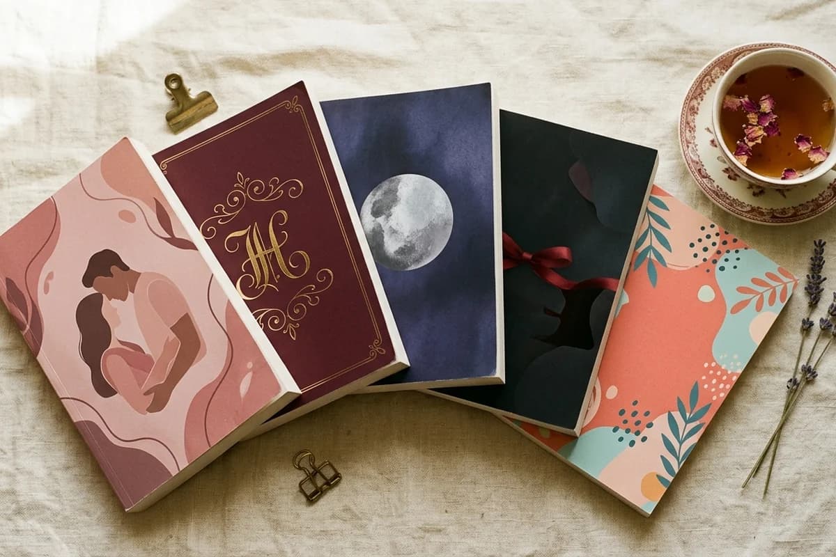
Contemporary romance is the largest subgenre by raw volume and the one most affected by the 2020 to 2024 illustrated cover wave. Two distinct looks dominate the bestseller list in 2026, and choosing between them is the first design decision.
The illustrated look. A flat or lightly textured illustration of a couple, almost always slightly stylized rather than realistic, on a warm pastel or jewel-tone background. Title in a cursive script, author name in a clean sans-serif. Palette skews peach, coral, soft teal, warm cream, dusty pink. This is the BookTok look. It dominates rom-com, small-town romance, and friends-to-lovers.
The photographic look. A real-world couple, usually in mid-kiss or mid-embrace, photographed against a softly blurred environment that hints at setting (coastline, city skyline, vineyard). Title in a slightly more dramatic script or a modern condensed serif. Still works well for romantic suspense and contemporary stories with a strong sense of place.
The cursive script title is the single most important typographic convention in contemporary romance. It is so consistent that an absence of cursive on a contemporary romance cover reads as either literary fiction or a debut author who has not yet learned the rules. Use it deliberately. Pair it with a clean geometric sans-serif for the author name so the script does the emotion and the sans-serif does the legibility.
Historical romance: period dress, vintage typography, sepia tones
Historical romance has held onto its visual conventions more stubbornly than any other subgenre. Walk into a bookstore and you can identify a historical romance from across the room because the conventions are that specific.
The dominant composition is a single woman in period dress, photographed or rendered from a three-quarter angle, often with her face partially hidden or turned away. The dress does the work. A regency-era empire waist with puff sleeves signals regency. A bustle and corseted bodice signals Victorian. A simpler day dress with a bonnet signals Western or American historical. Readers know these silhouettes the way they know clothing in their own closet.
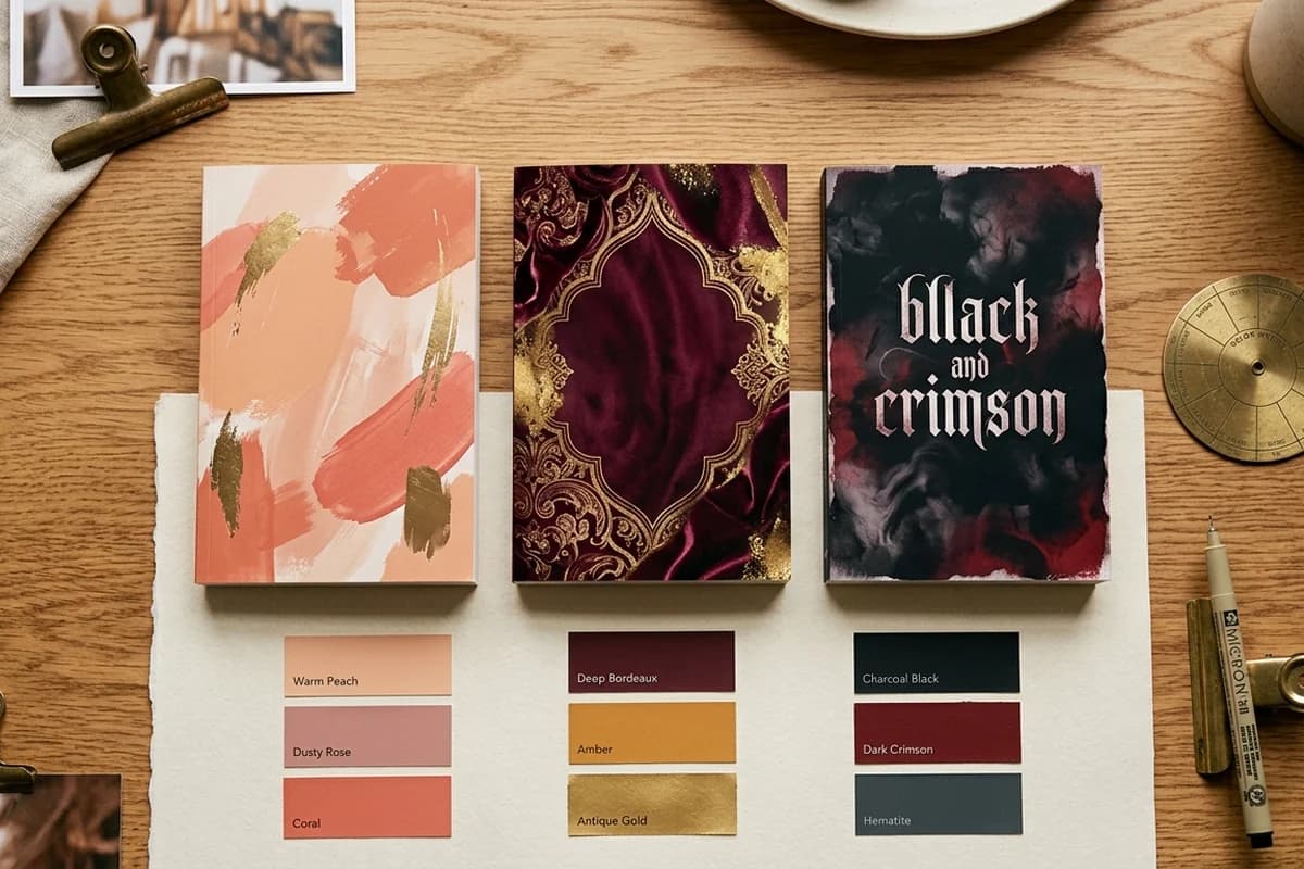
Typography skews elegant serif. Cormorant Garamond, Playfair Display, Trajan Pro, and Didone-style serifs all work. Avoid script for historical. Script reads contemporary, and contemporary undercuts the period setting. Palette uses deep jewel tones (burgundy, emerald, navy, gold) or sepia-tinted warm neutrals depending on the era and tone. Gold foil effects on the title are common and signal the elevated, slightly literary feel that historical romance readers respond to.
The face rule in historical romance
Historical romance covers frequently hide or partially obscure the heroine's face. This is intentional. It lets the reader project their own image onto the character, and it also avoids the problem that a single visible face can age a cover quickly when fashion shifts. If you include a face, make it three-quarter angle, mid-distance, and softly lit.
Paranormal romance (PNR): model plus supernatural element, deep colors
Paranormal romance lives in a specific compositional formula: a model (usually shirtless if male, often in dark form-fitting attire if female) layered against or in front of a single dominant supernatural element. The element is the genre signal. A wolf or wolf eyes signals shifter romance. Wings signal angel or fae. Fangs or red-rimmed eyes signal vampire. A glowing rune or sigil signals witch or warlock. A dragon silhouette signals dragon-rider or romantasy.
The mistake new PNR authors make is trying to communicate too many supernatural elements at once. A cover with wings, fangs, and a wolf is a cover that signals nothing. Pick one element, make it dominant, and let it carry the genre alone.
Palette runs dark. Deep purples, midnight blues, blacks, and rich blood reds dominate. Touches of metallic (silver, copper, gold) work well on titles. Lighting is dramatic: rim light, moonlight, or a single colored gel light source rather than even daylight. Typography uses sharp, slightly Gothic serifs or condensed sans-serifs. Cinzel, Trajan, Bebas Neue, and modified versions of these are everywhere on the PNR bestseller list.
Build subgenre-perfect romance covers in minutes
KDPEasy ships with subgenre-trained models for contemporary, historical, paranormal, dark, and cozy romance. Pick your subgenre, describe your book, get covers that match reader expectations.
Dark romance: silhouettes, monochrome, sharp serif
Dark romance has gone from niche to one of the most commercially powerful subgenres on Amazon in the span of five years. The visual conventions are now codified.
The base composition is high-contrast and visually quiet. A single silhouette (often a man, often from behind or in profile), a single symbolic object (a knife, a thorn, a chain, a rose, a mask), or a tight crop of a body detail (hands, neck, back). The image is usually photographic but heavily desaturated, sometimes pushed all the way to true monochrome. Background is black, deep charcoal, or a single deep accent color (blood red, deep crimson, bruised purple).
Typography is sharp. Condensed serifs in all caps (Cinzel, Trajan, modified Optima), or stark geometric sans-serifs. The title is often the largest element on the cover because dark romance readers want the title to feel like a brand. Foil effects (gold, silver, chrome, holographic) on hardcover and special editions have become a key part of the dark romance aesthetic and a signal of seriousness.
Subtitle treatment is also distinctive. A short tagline below the title (one to four words, often suggestive or evocative) appears on more dark romance covers than on any other subgenre. Examples include phrases like "a dark mafia romance" or "a forbidden love story" - written as a tagline, not part of the title.
Cozy romance: illustrated, light palette, cursive
Cozy romance (small town, slow burn, low or no spice, often holiday-adjacent) has its own visual signature. Almost always illustrated. Palette skews soft and warm: cream, sage green, dusty rose, soft coral, butter yellow. Compositions feature warm objects (a teacup, a Christmas tree, a beach umbrella, a porch swing, a bookstore window) more than people. When characters appear, they are illustrated rather than photographed and usually shown mid-laugh or mid-conversation rather than mid-kiss.
Typography is the same cursive script as contemporary romance, but softer. The script reads friendly rather than passionate. Author name in a rounded sans-serif (Quicksand, Nunito, modified Inter). Subtitles are common and often spell out the cozy promise: "a small town second chance romance" or "a holiday novella."
Cozy romance is the cleanest example of a subgenre where mismatching the visual conventions actively repels your audience. A dark or spicy cover on a closed-door cozy romance leads to one-star reviews from readers who expected steam and did not get it. The cover is the warning label. Make it match the contents.
Why illustrated covers exploded after 2020
Romance was the first genre to shift heavily toward illustrated covers, and the shift was not driven by aesthetics alone. Four forces collided:
- BookTok and Bookstagram. Short-form video and image-first social platforms reward thumbnails that read instantly at small size. Flat, brightly colored illustrations outperform photographic models in these formats. A photograph dims at small sizes. A flat illustration does not.
- Stock photo fatigue. By 2019, the same shirtless models were appearing on dozens of romance covers a year. Readers started joking about it. Illustrated covers solved the duplication problem instantly.
- Tropification of romance. Readers began shopping by trope (enemies to lovers, fake dating, marriage of convenience, grumpy sunshine) more than by setting or character. Illustrated covers communicate trope through symbolic composition better than photography does.
- AI image tooling. Midjourney, Stable Diffusion, and now Gemini-class image models brought illustration costs down by an order of magnitude. Indie authors who could not afford a $1,500 illustrated cover in 2019 can produce one for under $50 in 2026.
The cumulative result: illustrated covers reached parity with photo covers in contemporary romance by 2023 and now lead in rom-com and cozy. Photo covers still hold strong in dark, paranormal, and certain historical niches, but the long-run trend favors illustration.
The author name placement convention
Romance has a specific convention for author name placement that does not exist in most other genres. Three options, and the right one depends on where you are in your career:
- Below the title, smaller. Default for debut authors and series book one. The title carries the click, the author name is secondary. Roughly 70 percent of romance covers use this placement.
- Above the title, similar size. Used when the author has some name recognition. The name and the title share billing.
- Above the title, larger than the title. Used by established authors whose names sell the book. Lisa Kleypas, Penelope Douglas, Colleen Hoover, Tessa Bailey all put the name on top, larger than the title. This is a status signal as much as a placement choice.
Pick one and stay with it across the whole series. A series that switches placement between books one and two signals chaos to readers, even if they cannot articulate why the covers feel off.
Series cohesion: the rule that compounds
Romance is built on series and readthrough. The numbers are stark: a strong series with cohesive cover branding can readthrough at 70 to 90 percent across an entire trilogy. A weak series with inconsistent covers readthroughs at 20 to 30 percent. The difference is your retirement plan.
Six elements need to stay consistent across a series:
- Palette. Pick three to four colors and stay inside that palette for every book. You can shift the dominant color from book to book (book one heavy on rose, book two heavy on cream) but the palette stays.
- Typography. Same display font, same supporting font, same hierarchy.
- Composition style. If book one is illustrated, book two is illustrated. If book one uses a single model, book two uses a single model.
- Title position and scale. Same area of the cover, same approximate height as a percentage of cover height.
- Author name position. Same placement decision (above, below, larger, smaller) across the entire run.
- Series name treatment. A small banner, color block, or numeric badge that identifies this as part of the series. The numeric badge in particular helps readthrough.
The shelf scan test
Drop thumbnails of every book in your series next to each other at 200 pixels wide. Show them to someone for two seconds. Then hide them. Ask: did those look like one series? If they say yes, you have cohesion. If they say "I think so" or "kind of," you have a problem. The shelf scan test is harder than it sounds.
Color psychology by heat level
Romance readers identify heat level from palette before they read the back cover blurb. Mismatching palette and heat level is the most common reason romance readers leave one-star reviews. Match the visual to the contents.
- Sweet or closed-door: Pastels, soft creams, dusty pinks, sage greens, light blues. Often illustrated. Title in soft script.
- Open-door but mild: Warm peach, coral, soft teal, warm cream. Illustrated or softly photographed. Title in cursive script with slightly more weight.
- Spicy (explicit, frequent): Deep reds, burnt orange, deep gold, warm browns. Photo-heavy or illustrated with intimate body framing. Title in sharper script or condensed serif.
- Dark or explicit: Matte black, crimson, deep purple, silver foil. Heavy contrast. Title in stark all-caps serif or sans-serif. Often with a tagline.
AMS keyword and cover alignment
Your romance cover and your Amazon Ads keyword strategy are one system. Most authors treat them as two separate decisions. They are not.
When a reader clicks an ad triggered by the keyword "enemies to lovers dark mafia romance," they have a specific visual expectation. If your cover does not deliver dark mafia within a second, the click was wasted. You paid for the impression and the click but lost the conversion. The fix is to design the cover and choose the keywords together.
- If you target "small town second chance romance," your cover should read cozy or contemporary illustrated, warm palette, soft script.
- If you target "dark mafia enemies to lovers," your cover should read dark romance, matte black palette, stark serif, tagline.
- If you target "regency romance," your cover should read historical, period dress, jewel tones, elegant serif.
- If you target "shifter romance" or "fated mates," your cover should read paranormal, single supernatural element, dark palette.
This sounds obvious but the most common ad-budget waste in romance is paying for clicks that land on a cover that does not match the keyword. Audit your top three AMS keywords against your cover. If they read as different genres, fix one of them.
Title legibility at 200 pixels wide
Amazon search results display your cover at roughly 200 pixels wide. BookTok thumbnails are even smaller. If your title is not legible at that size, you are paying for visibility without earning the click.
Test before you finalize. Export the cover as a JPG. Resize to 200 pixels wide. Look at it from three feet away. Three checks:
- Can you read the title without leaning in?
- Can you identify the genre within two seconds?
- Does the author name read or does it disappear?
If any of those fail, the cover is not ready. Common fixes: enlarge the title relative to other elements, increase contrast between the title and the background, simplify the background under the title (a knockout shape or color block), pick a sturdier font weight.
Common romance cover mistakes (and the fixes)
Mistake 1: subgenre confusion
Using paranormal imagery for a contemporary romance, or dark colors for a sweet romance. Readers do not give you the benefit of the doubt. They skip. Fix: study the top 20 covers in your exact Amazon subcategory and match the visual language.
Mistake 2: too many fonts
Three fonts is the maximum. Two is ideal. Title font does emotion. Author font does legibility. Optional third font for a tagline or series banner. Anything beyond that reads amateur.
Mistake 3: stock photo duplication
The same stock photo shirtless model appearing on twelve different covers is a real problem in romance. Either pay for premium exclusive stock, generate your own through AI tools, or shift to illustration to sidestep the issue entirely.
Mistake 4: ignoring the back cover
On paperback editions, the back cover is half your conversion surface. A back cover with a weak hook line and a wall of blurb text loses sales the front cover would have won. Treat it like a landing page, not an afterthought. The wraparound design tips guide covers back-cover hierarchy in detail.
Mistake 5: designing for the author, not the reader
The biggest one. Authors want a cover that captures the story. Readers want a cover that confirms the genre. Convention first, originality second. Differentiate in execution, not in composition.
Skip the conventions research
KDPEasy already knows what each romance subgenre is supposed to look like in 2026. Pick contemporary, historical, paranormal, dark, or cozy and generate on-convention covers from a single prompt. Free first cover.
Romance cover checklist for KDP
Before you upload to KDP, run through this list:
- Cover identifies subgenre within one second
- Palette matches the heat level of the book
- Title legible at 200 pixels wide
- Author name placement is intentional and series-consistent
- Maximum three fonts, two preferred
- Composition matches the top 20 bestsellers in your subcategory
- Series elements (palette, position, fonts) consistent with book one
- AMS keyword strategy reads as the same genre as the cover
- Paperback edition uses a single full-wrap PDF at 300 DPI with correct spine width
- Ebook is 1600 by 2560 pixels minimum, RGB JPG
For technical specs on paperback covers, see the step-by-step full wrap cover tutorial. For spine width math, the KDP spine width formula guide covers every paper type. If you want the dimensions calculated automatically, the KDP cover size calculator handles trim, spine, and bleed in one screen.
The single biggest leverage point
The most successful romance authors on KDP do not have the most beautiful covers. They have the most on-convention covers. They follow subgenre rules ruthlessly, then differentiate in execution. If you take one thing from this guide, let it be that. Convention compounds. Originality without convention loses to convention without originality every single time.
Related articles
Frequently asked questions
A romance cover sells when it signals the exact subgenre (contemporary, historical, paranormal, dark, cozy) within a second, matches the heat level expected by readers, uses a clear two-font system with the title legible at thumbnail size, and looks consistent across the series so book one carries the rest. Cover-to-product alignment with your AMS keywords is the multiplier most authors miss.
In 2026 the answer is subgenre-dependent. Contemporary and rom-com lean illustrated. Dark romance and paranormal still favor model-driven photography or model-plus-symbol composites. Historical sits between, often using a single woman in period dress. The fastest decision shortcut is to study the top 20 covers in your exact Amazon subcategory.
Three things converged: TikTok created a discovery channel where flat, brightly colored thumbnails outperform photographic ones, stock-photo fatigue meant the same models were appearing on dozens of covers, and AI image tools made high-quality illustration affordable for indie authors. By 2024 illustrated covers had reached parity with photo covers in contemporary romance, and they now dominate rom-com.
Romance has its own placement convention. Below the title for debut authors and series book one, above the title (often larger than the title) once the author name itself has pull. Established names like Lisa Kleypas or Penelope Douglas put the name on top because the name sells the book. Pick a spot, then keep it consistent across the entire series.
Pair a single display font with a single supporting font. Contemporary and cozy romance use cursive script titles (Allura, Pinyon, Bickham) with a clean sans-serif author name. Historical uses elegant serifs (Cormorant, Playfair). Dark romance uses sharp condensed serifs (Cinzel, Trajan) or stark sans-serifs in all caps. Avoid trendy fonts that date quickly and any font you cannot read at 200 pixels wide.
Lock in a palette of three to four colors and use it across every book. Keep the title in the same position with the same font and size scale. Reuse the same illustration style or photography treatment. Add a small series-name banner or color block somewhere consistent. The shelf scan test is the standard: thumbnails side by side should read as one set within two seconds.
Romance readers decode heat from palette before they read a single word. Pastels and soft creams signal sweet or closed-door. Warm peach and coral signal contemporary rom-com with mild steam. Deep red and burnt orange signal spicy. Matte black with crimson, silver foil, or chrome signals dark and explicit. Mismatched palette and heat level is the most common one-star review complaint in romance.
Your cover and your Amazon Ads keywords are one system. If you target "enemies to lovers dark romance" your cover should read dark before it reads romance. If you target "small town cozy romance" your cover should read cozy before it reads romance. Mismatched cover and keyword targeting burns ad spend because the click happens but the buy does not.
No. Romance uses the same KDP cover dimensions as every other genre. Ebooks ship as 1600 by 2560 pixel JPGs. Paperbacks require a single full-wrap PDF with bleed and spine width calculated from your trim, page count, and paper type. Use the KDPEasy KDP cover size calculator if you do not want to do the math.
Designing for the author, not the reader. Authors want a cover that captures the story. Readers want a cover that confirms the genre. The most successful romance covers look like other successful romance covers in their exact subgenre with one or two distinct differentiating notes. Originality lives in execution. Convention lives in composition.

Written by Danielle Okonkwo
Marketing & Growth Lead at KDPEasy
Danielle is a published author with 12+ titles on Amazon KDP and a former book blogger. She writes KDPEasy's guides drawing from hands-on publishing experience and years of testing what actually works in the KDP marketplace.
View profile