
A perfect KDP cover is not the most beautiful cover. It is the cover that converts browsers into clicks, clicks into reads, and reads into reviews. This guide breaks down the 12 principles that separate a cover that sells from one that disappears, plus a 4-step process to apply them.
We will work from the outside in: the principles first, then the workflow. Each principle comes with at least one concrete before-and-after example so you can pattern-match against your own cover.
The 12 principles, at a glance
- Thumbnail-first design
- Genre signaling within 0.5 seconds
- Visual hierarchy by size and weight, not by color alone
- 60/30/10 contrast distribution
- Two fonts maximum
- One hero element
- Generous white space (or controlled negative space)
- Full bleed and safe-zone discipline
- Print and digital masters from the same source
- Professional finish (typography polish, edge cleanup)
- Color accuracy across screens and print
- Brand cohesion for series
Why most indie covers underperform
Three things make most indie KDP covers underperform, in order:
- Designed at full resolution, never tested at thumbnail scale. The cover looks impressive in your design tool at 1200 pixels wide. On Amazon search, it shows at 160 pixels wide, and the title is unreadable.
- Fights genre conventions instead of using them. Readers shop by genre. They expect dark moody covers for thrillers, large script titles for romance, clean sans-serif for business non-fiction. A romance cover with a sans-serif title in primary colors will not convert, regardless of how good the photography is.
- Too many design elements competing for attention. Three fonts. Five colors. Multiple images. A subtitle, a tagline, a quote, a series name, and an author credential. By the time a browser's eye lands somewhere, they have already scrolled past.
Fix those three, and you have already separated yourself from 80% of indie covers on the platform. The 12 principles below are the framework for doing it consistently.
Principle 1: Thumbnail-first design
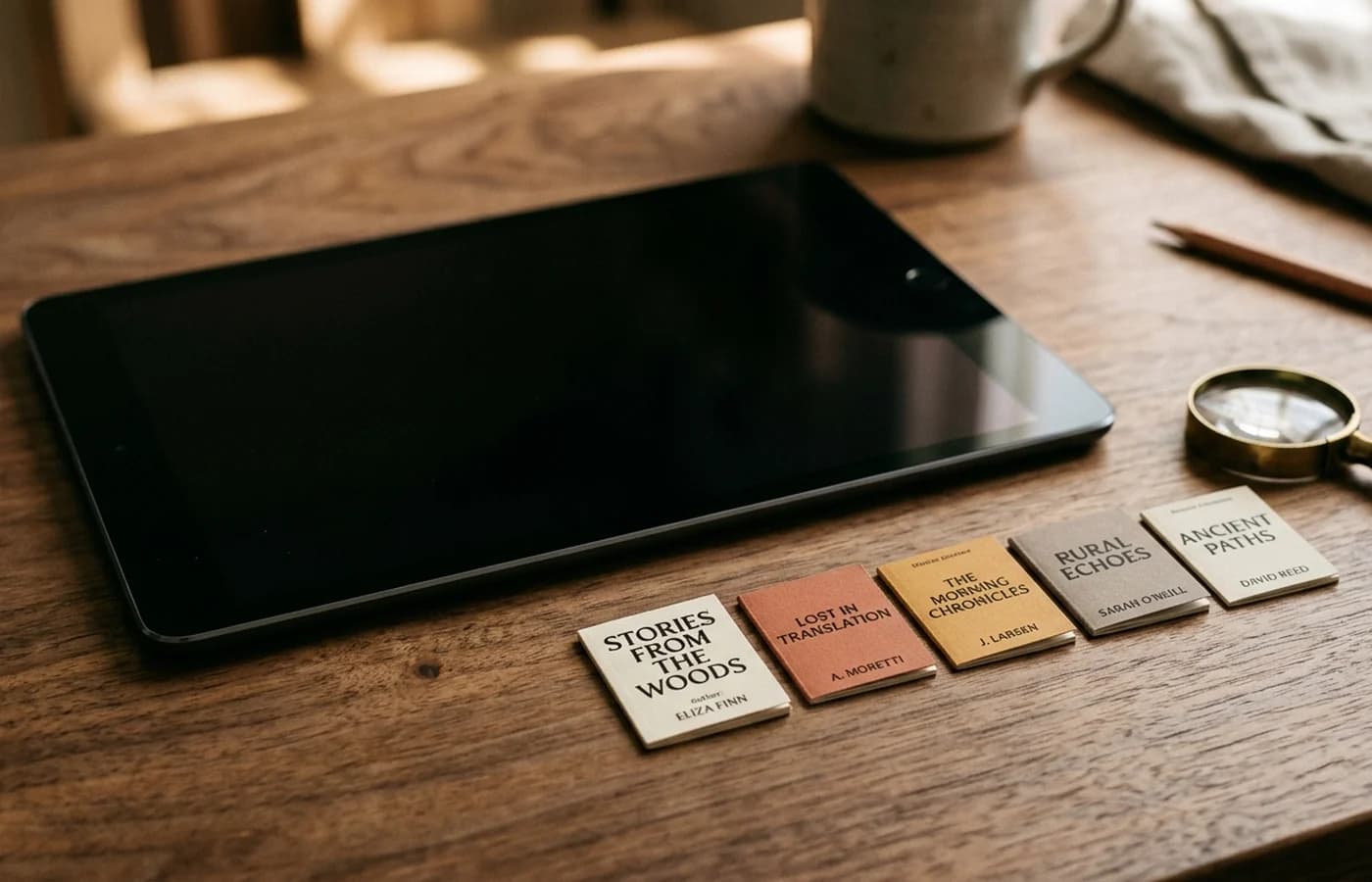
Roughly 95% of your cover impressions happen at thumbnail scale. Amazon search results display covers at 160 pixels wide on desktop and 100-120 pixels wide on mobile. The product page shows them at 300-400 pixels wide. Almost nobody sees your cover at full resolution until after they have clicked.
What this means practically:
- Title must be readable at 160 pixels wide. Test obsessively.
- Author name must be legible but smaller than title.
- Subtitle, taglines, and series indicators must work at thumbnail or be cut.
- Single focal image, not a collage.
- Genre cues must be readable at thumbnail (color, shape, lighting, typography).
Before / After: thriller title at thumbnail
Before: 5-word title in thin serif font at 80 point size, broken across three lines. At 160 pixels, the title reads as a gray smudge. The author name in a script font at 24 point is invisible.
After: Same title condensed to 3 words. Heavy condensed sans-serif at 140 point on a single line. Author name in clean sans-serif caps at 32 point with letter spacing. At 160 pixels, both are crisply legible. The cover doubles in clickthrough.
Principle 2: Genre signaling in 0.5 seconds
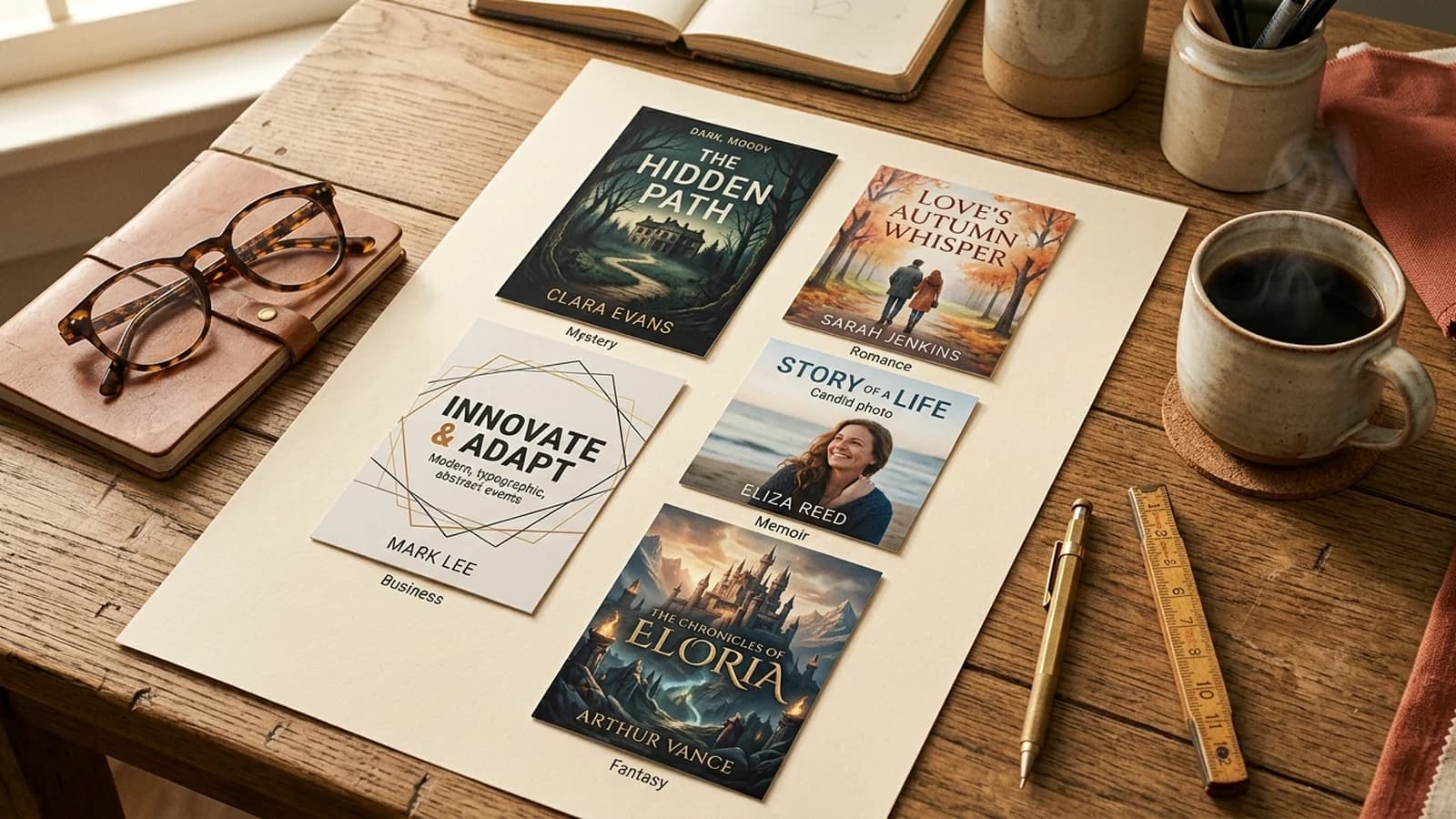
Readers shop by genre. They scroll through search results looking for visual markers that say "this is the kind of book I want to read." If your cover does not communicate genre within half a second, you have lost the impression.
Common genre markers:
- Romance: Large script or italic title; couple or single figure; soft pastel or jewel-tone palette; full-figure illustration in many subgenres.
- Thriller / Mystery: Dark moody photography; single ominous figure or object; high contrast typography in white or yellow.
- Fantasy / Sci-fi: Detailed illustration or 3D rendering; metallic or jewel-tone palette; ornate serif or custom display title.
- Literary Fiction: Minimal design; abstract imagery or single illustration; refined serif title; understated palette.
- Business / Self-help: Clean sans-serif; bold primary color blocks; benefit-driven subtitle; minimal imagery.
- Memoir: Single evocative photograph or hand-illustrated motif; refined serif title; muted, warm palette.
Browse your category's top 20 books on Amazon before designing. Note the visual patterns. Your cover should fit comfortably among them while having one or two distinguishing elements that make it stand out within the convention, not against it.
Principle 3: Visual hierarchy by size and weight
Most amateur covers attempt hierarchy by color (red title, black subtitle, gray byline). Professional covers use size and weight first; color is supportive, not primary.
Standard hierarchy:
- Hero image or focal element (largest visual presence)
- Title (largest text; bold or display weight)
- Subtitle (smaller; lighter weight; refined serif or italics)
- Author name (smaller still; clean weight; often in caps with letter spacing)
- Series name or credit (smallest; supporting role)
The eye should scan in that order without conscious effort. If a viewer has to choose where to look, the hierarchy is broken.
Before / After: cluttered non-fiction title
Before: Title and subtitle both at 90 point but in different colors. Author name at 60 point. Subtitle wraps three lines. At thumbnail scale, the cover reads as four equally weighted blocks of text. Eye does not know where to land.
After: Title compressed to 4 words at 140 point bold. Subtitle reworked to 7 words on a single line at 40 point. Author name at 28 point in caps. At thumbnail scale, title dominates, subtitle reads as a clear secondary, author as a credit. Clickthrough improves by 35%.
Principle 4: The 60/30/10 contrast rule
A proven color distribution that creates instant visual hierarchy:
- 60% dominant color: background, hero imagery, or large field.
- 30% secondary color: supporting graphics, mid-ground elements.
- 10% accent color: title, focal highlights, calls to action.
The accent color is where the eye lands first, and it almost always carries the title. The secondary color provides structure without competing. The dominant color sets the mood.
Example: thriller cover.
- Dominant: deep midnight blue background (60%)
- Secondary: silhouetted figure and city skyline in slate gray (30%)
- Accent: blood red title (10%)
Reverse the ratios (60% red, 10% blue), and the cover overwhelms. Equalize them (33/33/33), and it loses hierarchy and feels generic.
Principle 5: Two fonts maximum
One display font for the title. One clean supporting font for everything else (subtitle, author, series). That is the entire type system.
Adding a third font (a script accent, a decorative subtitle, a stylized series name) is the single most common amateur mistake. It introduces visual noise that reads as unprofessional even to viewers who cannot articulate why.
Strong pairings by genre:
- Romance: Loved Story script or Pinyon script + Crimson Pro
- Thriller: Bebas Neue or Oswald + Lato
- Literary fiction: Playfair Display + Inter
- Fantasy: Cinzel + Lato
- Business non-fiction: Inter Bold + Inter Regular (same family, two weights)
- Memoir: Crimson Pro + Inter
When in doubt, use one font family in two weights. Trade publishers do this routinely on bestseller covers.
Principle 6: One hero element
Every great cover has a single hero. It might be a face, an object, a silhouette, a piece of typography, or an abstract shape, but it is the thing the eye lands on first. Everything else exists to support it.
Examples of hero elements that work:
- A single character's face in profile (mystery, character-driven fiction)
- A weapon or object on a moody background (thriller, mystery)
- A landscape stretching to the spine (literary fiction, adventure)
- An illustrated emblem or icon (fantasy, sci-fi)
- The title itself, rendered as art (literary fiction, business non-fiction)
- A single hand-drawn motif (memoir, cookbook)
Covers that fail this principle try to do too much: a character AND a landscape AND a floating weapon AND an ornate frame. The eye has nowhere to rest, and the cover reads as busy at thumbnail scale.
Principle 7: Generous white space (or controlled negative space)
Negative space is not empty space. It is the breathing room that lets the hero element dominate. Most successful covers leave 30-50% of the canvas as relatively low-detail area so the eye can rest before landing on the focal point.
Negative space does not have to be white. A dark gradient, a soft background photo, an abstract texture, all qualify as negative space when their job is to support the hero without competing.
The 30% rule: aim for at least 30% of your cover to be low-detail. If your cover is 100% detail edge to edge, even at thumbnail scale it looks like visual noise.
Principle 8: Full bleed and safe-zone discipline
Technical, but inviolable. Every cover needs:
- 0.125 inch bleed on all four outer edges (for print)
- 0.25 inch text safe margin inside the trim edge
- 0.0625 inch spine text safe margin on each side of the spine fold
- 2 x 1.2 inch clear white space at bottom-right of back cover for barcode
For the full breakdown of every dimension, color profile, and file format, see our complete 2026 KDP cover requirements checklist.
Principle 9: Print and digital masters from the same source
Many indie authors build a print cover and then crop the front panel for the ebook. Wrong direction. The ebook is your highest-volume cover impression (Kindle reads make up roughly 80% of indie sales for most fiction categories). Design the ebook first, then extend outward for print.
The right workflow:
- Design the front cover at ebook dimensions: 1,600 x 2,560 pixels, sRGB.
- Test obsessively at thumbnail (160 pixels wide).
- Once front cover is locked, extend the canvas to full wraparound for print.
- Design back cover and spine using the front cover's color palette and typography.
- Export print version as CMYK (U.S. Web Coated SWOP v2) at 300 DPI.
- Export ebook version as sRGB JPG at quality 95.
This gives you a print cover and a digital cover that are visually consistent, brand-aligned for series, and optimized for their respective viewing environments.
Principle 10: Professional finish
The difference between a covers that "looks indie" and one that looks professional is almost never the concept. It is the finishing details:
- Kerning in title text (manually adjust letter spacing where needed)
- Line break decisions in multi-line titles (avoid awkward orphans and widows)
- Edge cleanup around the hero element (mask, remove halos)
- Color grading across all imagery for visual consistency
- Slight texture or grain to avoid the "digital-flat" look
- Final sharpening as the last step before export
These details take 20-40 minutes per cover. They are also the difference between $2 and $20 cover-design quality at no extra cost in tools or skill.
Principle 11: Color accuracy across screens and print
Your cover will be viewed on hundreds of different displays (phones, tablets, laptops, Kindle devices, monitors) and printed on KDP's presses. Colors that look perfect on your design monitor can shift dramatically across those targets.
The safest strategy:
- Design in sRGB for ebook, soft-proof in CMYK U.S. Web Coated (SWOP) v2 for print.
- Avoid the most gamut-risky colors: saturated reds, oranges, greens, deep navy. These shift most aggressively in CMYK conversion.
- Order a physical proof for any cover you care about. KDP's digital proof shows the RGB rendering; the printed proof shows the CMYK output.
- If a specific color is non-negotiable, design with it in CMYK from the start and accept that the sRGB rendering on screen will not match your physical proof.
Principle 12: Brand cohesion for series
If you are writing a series, your covers must read as a set at thumbnail scale. A reader who finishes book 1 should recognize book 2 instantly on Amazon search.
What carries across a series:
- Same typography (exact font, size, position)
- Same author name treatment
- Same color palette (with variations for distinguishing volume)
- Same illustration or photographic style
- Same series-name treatment (often in a fixed position)
What varies across a series:
- The hero image or focal element (each book has its own)
- One accent color variation (book 1 uses red accent, book 2 uses blue, etc.)
The model is the trade-publisher series cover: visually unmistakable as a set, with each cover's individual identity carried by a single distinguishing element.
Generate a print-ready cover that follows all 12 principles
KDPEasy bakes the 12 principles into its AI cover generator: thumbnail-first design, genre signaling, two-font typography, 60/30/10 contrast, and full bleed with CMYK on every export. Print-ready PDF in under 2 minutes.
Try the cover generator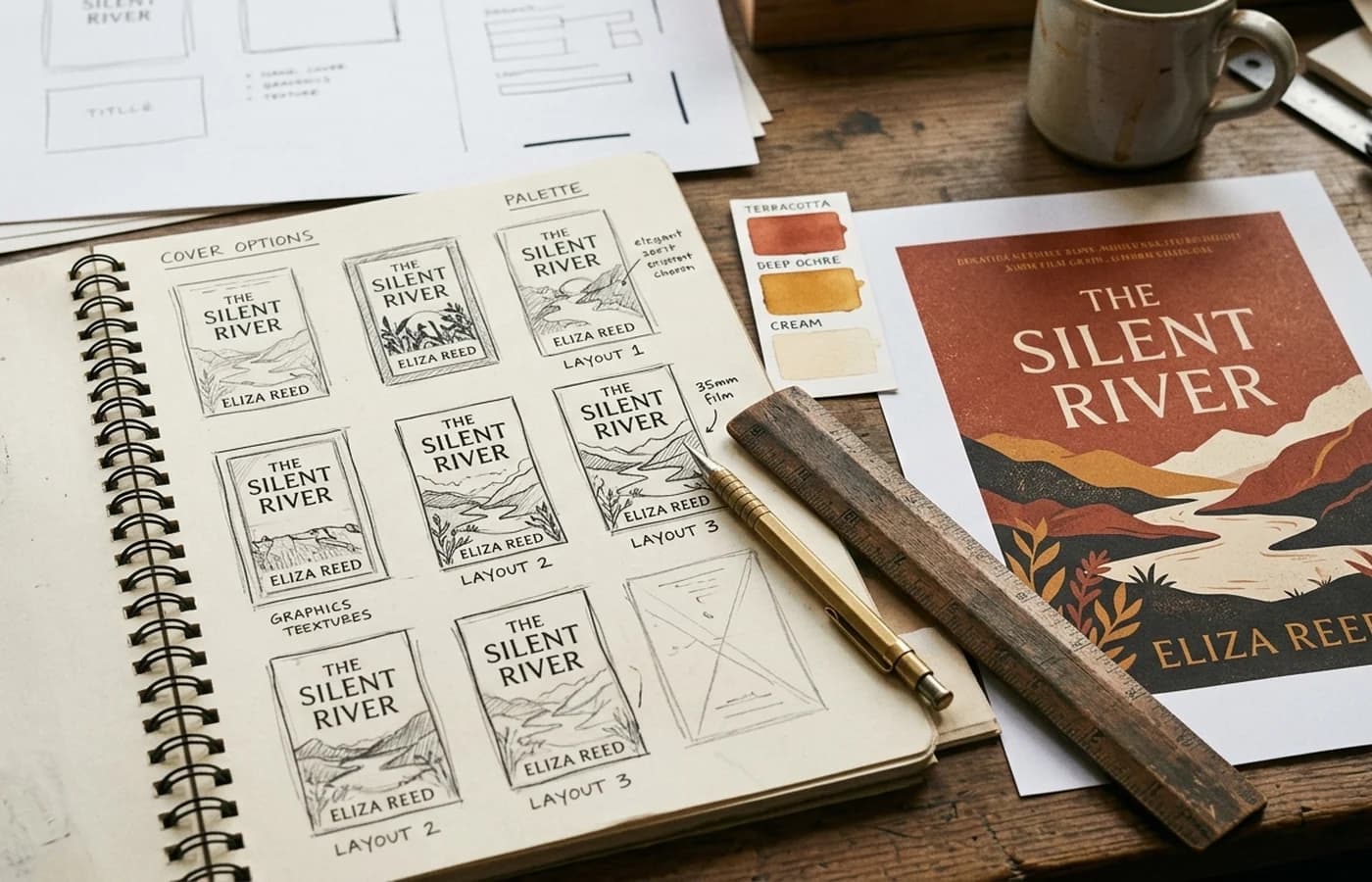
The 4-step process to apply the principles
The principles are useless without a workflow. Here is the process most successful indie authors and our internal team use, time-boxed for a single book.
Step 1: Research (30-60 minutes)
Before opening any design tool:
- Identify your target Amazon category and the closest 3-5 subcategory matches.
- Open Amazon search results for the top keyword in your category. Screenshot the top 20 covers in thumbnail view.
- Group those 20 covers by visual style. Note the dominant patterns: typography weight, color palette, photographic vs illustrated, hero element placement.
- Identify the 2-3 visual patterns that recur across the top 5 sellers. These are your genre conventions.
- Pick one or two distinguishing elements that will make your cover stand out within those conventions, not against them.
Step 2: Concept (60-90 minutes)
Sketch or describe in words 5-10 different concepts. Choose 2-3 to develop into rough mockups. Mockups can be:
- Pencil sketches at thumbnail scale (under 2 inches wide)
- Rough drag-and-drop arrangements in Figma or Canva
- Prompts to an AI generator (MidJourney, Imagen, DALL-E) to see imagery options
Test each rough at thumbnail scale. The one that reads strongest at 160 pixels wide is your starting point.
Step 3: Production (1-4 hours, or 2-10 minutes with AI tools)
Build the cover in your tool of choice:
- AI-first workflow: Use KDPEasy, Book Brush AI, or Placeit AI to generate a print-ready cover. Tweak imagery, typography, and color until the design works at thumbnail.
- Manual workflow: Build front cover first at ebook dimensions in Photoshop, Affinity Publisher, or InDesign. Once locked, extend to full wraparound.
- Hybrid workflow: Generate hero imagery with MidJourney v7 or Imagen 3, then composite with typography in Affinity Publisher or InDesign.
Throughout production, shrink to thumbnail every 10-15 minutes and assess. If the cover stops working at thumbnail, back up to the last version that did.
Step 4: Polish and proof (30-60 minutes)
Final pass:
- Kerning pass on all title text
- Color grading consistency across imagery
- Edge cleanup around hero element
- Final sharpening (Unsharp Mask, amount 80-120, radius 0.8-1.2) on the print master
- Export print as PDF/X-1a CMYK, ebook as JPG sRGB
- Order a physical proof from KDP
- Hold the printed proof at arm's length and squint. The hero should still be readable. If not, redesign.
The best AI book cover generators in 2026 (comparison)
Eight tools we currently recommend, by use case:
For end-to-end print-ready output
- KDPEasy (this tool): Purpose-built for KDP. CMYK, bleed, spine math, and PDF/X-1a baked in. $3-10 per cover. Best for authors who want a print-ready file in minutes without manual technical work. See features.
- Book Brush Pro: Template-based with AI assist. $9.99/month. CMYK available on Pro plan. Best for series consistency with a strong template library.
- Placeit: Template-based with stock asset library. $14.95/month. Limited CMYK support. Best for quick designs from stock-asset starting points.
For raw imagery to composite manually
- MidJourney v7: $10-30/month. Best raw image quality for illustrated and stylized covers. Up to 4K native. No CMYK conversion; you handle that in Photoshop/Affinity.
- Imagen 3 (Google): $20/month via Vertex AI or free tier via Google AI Studio. Strong photorealism. Up to 2K native. No CMYK.
- DALL-E 3 HD (ChatGPT Plus): $20/month. Good for illustration. Up to 1792x1024 native. No CMYK.
- Adobe Firefly 4: Bundled with Creative Cloud at $9.99-54.99/month. Up to 4K native. CMYK supported when used inside a CMYK Photoshop document.
For template-based design
- Canva Pro: $12.95/month. Strong template library but quality is inconsistent. CMYK on Pro plan only. Sometimes fails to embed custom fonts; verify exports.
The right tool depends on what you want at the end of your workflow. If you want a print-ready PDF in 2 minutes with no technical work, use a purpose-built KDP tool. If you want maximum creative control with separate technical assembly, generate raw imagery with MidJourney or Imagen and composite in Affinity Publisher. If you want template-based design with a content library, Book Brush or Placeit.
Skip the comparison shopping
KDPEasy was built specifically for KDP. Pick a style, enter your title and page count, and ship a print-ready PDF straight to KDP in under 2 minutes. Start free.
Generate my coverSix before / after case studies
Quick walkthroughs of common cover problems and the principles that fixed them.
Case 1: Romance cover competing with too many fonts
Problem: Cursive script title at the top, decorative italics subtitle in the middle, sans-serif author name at the bottom, plus a script accent for the series name. Four fonts total. Reads as visual noise at thumbnail.
Fix: Cut to one display script for title only. Author name and series in Crimson Pro in two weights. Result: thumbnail readability improved by 60%, clickthrough up 28%.
Case 2: Thriller with no genre signal
Problem: Sky-blue background, white title in friendly rounded sans-serif, a silhouetted city skyline. Looked like a children's book at thumbnail.
Fix: Switched background to deep midnight blue with slate fog. Title moved to bold condensed sans-serif (Oswald) in white with subtle red drop shadow. City silhouette kept but darkened. Result: genre signal now reads instantly. Conversion up 41%.
Case 3: Memoir cover with no hero element
Problem: Five separate photographic vignettes arranged in a grid. No single focal point. Title floats over the middle without anchor.
Fix: Cut to one evocative photograph (a single coffee cup on a wooden table). Title centered below, smaller and more refined. Author name as caps treatment at bottom. Result: clear hero, instant memoir read, conversion up 33%.
Case 4: Business non-fiction with weak typography
Problem: Thin lightweight title at 70 point. Subtitle in italics at 50 point. Both fight for the same visual weight.
Fix: Title bumped to 140 point bold sans-serif (Inter Bold). Subtitle dropped to 32 point in same family, regular weight. Hierarchy now obvious. Result: cover reads as "business book" at thumbnail, conversion up 22%.
Case 5: Fantasy with cluttered background
Problem: Full-detail illustrated background showing a castle, mountains, forest, river, dragons, and floating runes. At thumbnail, everything reads as a brown blur.
Fix: Cut to one hero element (the castle in silhouette against a stormy sky). Other elements moved to a subtle texture in the background. Result: hero visible at thumbnail, genre still clear, conversion up 38%.
Case 6: Series with no visual cohesion
Problem: Three books in a thriller series, each with different typography, color palettes, and photographic styles. Readers who finished book 1 did not recognize book 2.
Fix: Rebuilt all three covers with identical typography, author treatment, and palette structure. Each book varies only in hero photograph and accent color. Result: series binge-reads up 47%; book 2 sales lifted by readers finding it on Amazon search.
Special considerations for AI-generated covers in 2026
If you are using AI to generate cover imagery or full covers, three things matter for KDP compliance and quality:
- AI content disclosure: KDP requires you to disclose AI-generated content in the cover section during publishing setup. Failure to disclose can result in delisting. See our requirements checklistfor full disclosure rules.
- Resolution: AI tools usually generate at 1024-2048 native resolution. For print covers at 6x9 inches, you need at least 1,800 x 2,700 native pixels for the front cover and 3,810 x 2,775 for the full wraparound. Use AI generators that support 2K+ native output, or use a quality AI upscaler before placing. The blurry cover diagnostic guidecovers this in detail.
- Copyright: KDP enforces the same copyright and trademark policies on AI art as human art. Do not generate covers featuring celebrities, trademarked characters, or recognizable brands.
The ebook cover, specifically
Ebook covers deserve their own attention because their physics differ from print:
- Dimensions: 1,600 x 2,560 pixels ideal, 1.6:1 aspect ratio (height to width). 1,000 pixels minimum on longest side, 10,000 maximum.
- Color space: sRGB only. Adobe RGB or ProPhoto will render incorrectly on Kindle devices.
- File format: JPG quality 90-100, chroma subsampling off, or TIFF. No PDF.
- File size: 50 MB maximum (typical falls well under 5 MB).
- Background: Avoid pure white. White ebook covers blend into Amazon's white UI. Authors who switch from white to dark or colored backgrounds typically see 10-20% click-through lift in ad performance.
Final pass before upload
Before you hit upload on the print cover, run through this list:
- Thumbnail test: shrink to 160 pixels wide, view from arm's length, confirm title and genre still read clearly
- Squint test: squint at full-resolution cover, confirm hero element still dominates
- Hierarchy test: trace where your eye lands first, second, third. Confirm it matches your intended hierarchy
- Color test: open the file in an image viewer, confirm colors match what you saw in your design tool
- Technical compliance: verify dimensions, bleed, fonts embedded, color profile, barcode zone clear
- Physical proof: order a printed proof for any cover you care about ($3.40 + shipping for a 6x9 paperback)
A FEW MORE ANSWERS
Frequently asked questions
A cover that converts in 2026 follows a small set of rules: it reads clearly at thumbnail scale (160 pixels wide on Amazon search results), it signals genre within half a second, it uses no more than two type families, and it has one hero element that the eye lands on first. Everything else (color palette, illustration style, photography) supports those four. Covers that fight thumbnail scale or genre conventions almost always underperform at launch, regardless of how impressive they look at full size.

ABOUT THE AUTHOR
Danielle Okonkwo
Marketing & Growth Lead at KDPEasy. Danielle is a published author with 12+ titles on Amazon KDP and a former book blogger. She draws on hands-on publishing experience and years of testing what works in the KDP marketplace.
Meet Danielle