Self-help covers obey a tighter grammar than any other category on Amazon. The genre has converged on a near-universal formula: a bold sans-serif title that fills the cover, an author name with equal weight, one iconic visual, and a single color story. Break the grammar and the cover reads as cheesy, like a 2009 motivational seminar flyer. Hold the grammar and the cover reads as authority, like a Penguin Press hardcover. This guide is the working blueprint.
The anatomy of a winning self-help cover
Pick up any self-help book from the last decade that crossed a million copies sold and look at the cover in isolation. The structure is almost always the same. Title at top or center, sized so it occupies 40 to 60 percent of the cover's vertical space. Author name immediately below or above, in a clearly secondary but still confident weight. A single iconic visual or, often, no visual at all, just typography on a solid color. Subtitle present, short, readable at thumbnail size. Nothing else.
That restraint is the genre signal. Self-help readers are buying clarity. The cover has to look like the answer, not the question. If the cover is cluttered, the reader's gut reaction is that the book will be cluttered too. The category has trained millions of readers to associate minimalism with credibility, and the highest-converting covers lean hard into that association.
The five canonical self-help sub-genre palettes. From left to right, top to bottom: productivity, mindset, mental health, business, relationships.
Rule one: title dominance, always
The title is the only thing the reader has at thumbnail size. On a phone screen, at 160 pixels wide, the title is the cover. If the title does not lead with confidence, no amount of beautiful imagery rescues the cover, because the imagery is not legible at that scale anyway.
Practical implementation:
- Set the title in a heavy sans-serif. Inter, Montserrat, Helvetica Now Display, or any condensed grotesque all work. Avoid scripts entirely.
- Size the title so it occupies a minimum of 35 percent of the cover height. Many bestsellers push this to 55 percent.
- Maximize contrast against the background. White on saturated color, black on white, gold on navy.
- Stack the title in two or three lines if it has more than three words. Break on natural meaning units, not arbitrary character counts.
- Set the title flush left or centered. Avoid right-aligned titles. They scan poorly at thumbnail size.
Rule two: the author name is part of the brand
Self-help is a relationship category. Readers who finish one James Clear book want the next James Clear book, even if the topic is different. They are buying the author as a curator of advice they trust. That trust is signalled visually by giving the author name confident weight on the cover.
For unknown first-time authors, the author name should sit at 50 to 70 percent of the title size, typically in the same typeface as the title or a complementary one. The goal is to look like you belong on the same shelf as the established authors, not like a self-publishing experiment.
For credentialed authors, add the credentials directly under the author name in small caps. "DR. AMY CHANG, MD" or "PROF. JAMES OKAFOR, PHD" are doing important work on a cover for a mental-health or medical-adjacent self-help book. Credentials carry real weight in this category.
Rule three: one iconic visual, or none at all
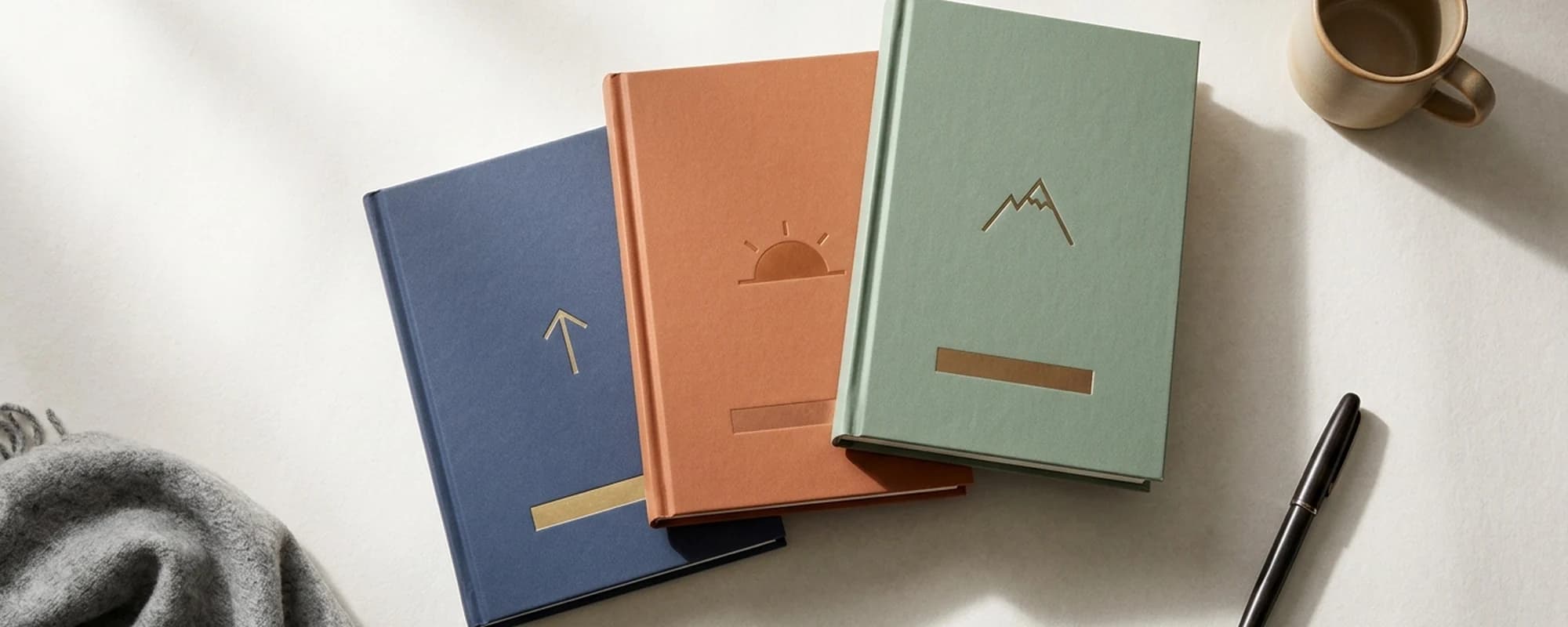
The iconic visual is the most misunderstood element of self-help cover design. The mistake authors make is treating it as decoration. The icon is not decoration. It is a memory anchor. When a reader recommends the book to a friend, the icon is what they describe. "The one with the upward arrow." "The one with the mountain." "The one with the single black circle on white." That single visual association is more durable than the title for many readers.
The canonical icons fall into five categories:
- Direction icons: arrows, compasses, paths. Best for productivity, career, and goal-setting books.
- Elevation icons: mountains, ladders, ascending lines. Best for ambition, mastery, and high-achievement books.
- Light icons: sunrises, single flames, lightbulbs. Best for clarity, awakening, and breakthrough books.
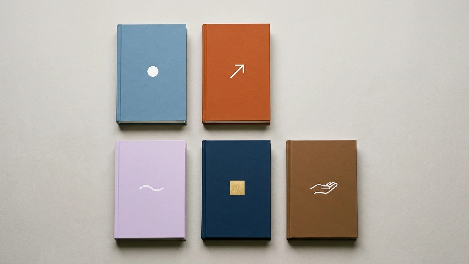
- Geometric icons: circles, squares, single lines, dots. Best for minimalist mindset, mindfulness, and meditation books.
- Body icons: hands, eyes, abstract figures. Best for emotional, relational, and somatic books.
Render the icon as a flat, stylized graphic. Never photographic, never gradient-heavy, never with three colors. The icon should be reducible to a sketch on a napkin. If a reader cannot redraw it from memory after reading the book, the icon was too complex.
Rule four: one color story, sub-genre coded
Self-help readers shop by sub-genre even when they do not realize it. The palette is the sub-genre signal. A productivity reader recognizes a productivity book by the cool, focused color before they consciously read the title. A mental-health reader recognizes a mental-health book by the soft pastel before they consciously read the title. Match the palette to the sub-genre and conversion goes up. Mismatch the palette and the cover signals the wrong promise to the wrong reader.
Productivity, habits, focus: cool blues and greys
Dusty blue, slate grey, and clean white dominate this corner of the category. The palette signals focus, clarity, and discipline. Black accents work. Saturated colors do not. Think of the white-and-soft-green of "Atomic Habits" or the steel-blue of "Deep Work." The covers say: I am calm, I am systematic, I will make your workflow quieter.
Mindset, motivation, ambition: warm orange and red
Saturated orange, deep red, and warm yellow signal energy and urgency. The palette is right for books about hustle, ambition, mental toughness, and high-performance. "Can't Hurt Me" is famous for its banana yellow. "The Subtle Art" uses a single orange Post-it. The covers say: I am going to push you, and you are going to like it.
Mental health, anxiety, healing: soft pastels and dusty creams
Muted lavender, dusty pink, soft sage, cream, and warm off-white anchor this sub-genre. The palette is the antidote to the high-energy mindset palette. It signals safety, slowness, and emotional permission. Recent bestsellers in this space lean into warm naturals that feel like a therapist's office, not a productivity workshop. The covers say: it is okay to slow down, this book will not yell at you.
Business, wealth, leadership: deep navy and metallic gold
Deep navy, black, and charcoal paired with metallic gold, bronze, or copper signal money and seriousness. The palette is the inheritance from the McKinsey-era business book aesthetic, modernized for indie publishing. Robert Greene's editions, Naval Ravikant's "Almanack," and Morgan Housel's "Psychology of Money" all sit in this palette. The covers say: this is an investment in your professional self.
Relationships, family, communication: warm earth tones
Muted terracotta, warm brown, soft umber, and dusty olive anchor relationship-focused self-help. The palette signals warmth, intimacy, and groundedness. Books on parenting, marriage, communication, and family systems often live in this register. The covers say: this is gentle and human and not transactional.
Palette tip: the 60-30-10 rule
Use your primary color for 60 percent of the cover, a neutral (white, black, or warm grey) for 30 percent, and an accent (often the icon or a small typographic detail) for the remaining 10 percent. This is the formula behind every famously clean self-help cover. Push past three colors and the cover starts to fragment.
Try a self-help cover layout you can actually ship
KDPEasy ships clean, minimalist self-help covers in the right palette for your sub-genre. Pick productivity, mindset, mental health, business, or relationships, then iterate from there.
The cheesy self-help trap: nine specific failure modes
Most rejected self-help covers do not have one big problem. They have a stack of small bad defaults that compound into a generic, dated look. Here is the checklist of failure modes to delete from your cover before it ever ships.
1. Stock photo of a person on a mountain
A silhouette with arms raised against a sunset is the single most overused image in self-help. Readers parse it as a stock-photo cliche the instant they see it. Replace with a single iconic mountain graphic or no image at all.
2. Motivational sunrise gradient
Orange-to-yellow-to-white gradient backgrounds were standard on motivational books in the 2000s. The visual code is now associated with low-credibility content. Use a solid color or a flat duotone instead.
3. Three competing fonts
Title in a serif, subtitle in a script, author name in a sans-serif. The cover instantly reads as amateur. One typeface is often plenty. Two is a comfortable maximum.
4. Exclamation point in the subtitle
Self-help has graduated past the exclamation point. The contemporary tone is calm authority, not infomercial enthusiasm. Delete every exclamation mark from the cover and the back-cover blurb.
5. Yellow or red starburst with BESTSELLER inside
Unless you genuinely cracked a real bestseller list, the starburst reads as desperation. Even when the claim is true, the visual is dated. Place earned bestseller status as a small, restrained text banner at the top of the cover, not a starburst.
6. Author headshot on the front
Unless you are Mel Robbins or Tim Ferriss, your face does not belong on the front cover. The back cover is the place for a credible author photo. The front is reserved for typography and the single iconic visual.
7. Drop shadows on the title
Drop shadows behind type are a 2008 PowerPoint move. Modern self-help covers favor flat, high-contrast type with no effects. If the title is not legible without a shadow, the contrast is wrong, not the missing shadow.
8. Stock icons rendered with chrome or 3D effects
The iconic visual must be flat. The moment you add gradient shading, chrome, or 3D rendering to a lightbulb or arrow, the cover collapses into mid-2000s clip-art territory. Flat is the law.
9. A subtitle longer than your blurb
Subtitles like "How Anyone Can Unlock the Hidden Power of the Mind and Manifest the Life of Their Dreams in 30 Days or Less With This Revolutionary New Method" are killing covers. Cut to the specific promise in twelve words or fewer. "A 28-Day Plan to Quiet Anxiety and Sleep Through the Night" is doing more work than the long version because a reader can actually read it at thumbnail size.
Eight cover examples described
Below are eight self-help cover patterns, described in enough detail to either inspire or mock up. These are not literal transcriptions of any one book, but each pattern is the shape of a category bestseller and worth keeping on your reference board.
Cover 1: Productivity, white and green
Pure white background. Title in heavy black sans-serif, three lines, stacked left-aligned, occupying the top two-thirds of the cover. Author name in matching black sans-serif at the bottom, smaller. A single saturated green square the size of a postage stamp anchors the right margin near the middle. No other elements. The whole cover reads as a perfectly tidy desk.
Cover 2: Mindset, banana yellow
Saturated banana yellow background, full bleed. Title in bold black sans-serif, single line or two-line stack, dead center. Author name in black sans-serif below, at half the title size. Subtitle in two short lines under the author name. No imagery. The cover is a slap, in the best possible way.
Cover 3: Mental health, dusty lavender
Soft lavender background, slightly warmer than pure violet. Title in muted cream sans-serif, two lines, slightly larger than usual to feel like a gentle hug. A single hand-drawn wavy line in cream sits below the title. Author name in cream small caps at the bottom. The cover whispers, it does not shout.
Cover 4: Business, deep navy with gold square
Deep navy background, almost black. Title in metallic gold serif, two lines, top half of the cover. A small gold-foiled square sits below the title as an icon. Author name in gold small caps at the bottom. The cover sells itself as the airport-bookshop edition of a future business classic.
Cover 5: Relationships, warm terracotta
Warm terracotta background, like sun-bleached clay. Title in cream sans-serif, three lines, centered. A single line-drawn open hand in cream sits between the title and the author name. Author name in cream sans-serif at the bottom. The cover feels like an actual relationship, warm and steady.
Cover 6: Self-discipline, charcoal and red accent
Charcoal background, almost black. Title in heavy white sans-serif, single word or two-word title. A single crimson red horizontal line cuts the cover at one-third from the top. Author name in white below, smaller. The cover communicates discipline without theatrics.
Cover 7: Mindfulness, cream and sage
Cream background. Title in muted sage green serif, three lines, centered, slightly looser tracking than usual for a relaxed feel. A single small black circle the size of a coin sits below the title as the iconic visual. Author name in sage small caps at the bottom. The cover reads as a meditation cushion.
Cover 8: Career change, dusty blue with white arrow
Dusty blue background. Title in heavy white sans-serif, two lines, top half. A single line-drawn upward arrow in white anchors the lower third. Author name in white sans-serif at the bottom. The cover is a literal instruction, and that is the point.
Typography choices that age well
The fonts that have aged well in self-help over the last decade share a small set of properties. They are sans-serif. They are heavy. They are slightly condensed or, at least, do not have wide character spacing. They have a strong vertical stress so they read as confident without becoming aggressive. Specific fonts that almost always work include Inter, GT Walsheim, Söhne, Futura Bold, Helvetica Now Display, and Untitled Sans. Serifs that work include Tiempos, Recoleta, Caslon, and Playfair Display, mostly for the more authoritative business and leadership end of the category.
Avoid: any handwritten script font on the title, any decorative slab serif with novelty character shapes, any italic-only font, and anything with a year in its name like "Helvetica 2020." Self-help covers should look like they were designed by someone confident enough not to chase trends.
The subtitle is doing real work
Self-help readers buy on a specific, named, time-bound promise. The title alone is rarely enough to deliver that promise. "Reclaim" is a title. "A 28-Day Plan to Stop Doom-Scrolling and Get Your Life Back" is the subtitle that converts.
Good self-help subtitles share four properties. They name a specific outcome. They name a specific timeframe or method. They are 12 words or fewer. They contain at least one concrete noun, like "plan," "system," "rules," "habits," "steps." Vague subtitles like "Discover the Power Within" are doing zero conversion work. Specific subtitles like "The Six-Week Method to Stop Drinking and Reclaim Your Mornings" are doing most of the heavy lifting.
Cover decisions for the print edition
The same minimalist front cover that wins at thumbnail also wins in print, but the back cover and spine carry real responsibility you do not have on the ebook.
- Back cover: a single pull quote from a credible source at the top, a two-paragraph blurb in the middle, a three-line author bio at the bottom-left, and a clean ISBN block at the bottom-right. No more than that.
- Spine: title vertical or horizontal depending on spine width. Set the spine using the spine width calculator guide.
- Paper choice: matte finishes signal premium in self-help. Glossy laminates read as mass-market and undercut the authority of the design.
AI cover generators and the cheesy default problem
Modern AI cover generators are excellent at the minimalist typographic layouts that dominate self-help. They are also, by default, willing to reach straight for every cheesy cliche the genre has accumulated over twenty years. A prompt of "self-help book cover" with no other constraints will land you in mountaintop-sunrise territory five times out of ten. The author has to prompt around the defaults.
Concrete prompt language that helps:
- "Minimalist Penguin Press hardcover, single solid color, no imagery, large bold sans-serif title"
- "Single iconic flat graphic, no gradients, no chrome, no 3D effects"
- "Editorial book design, not motivational poster"
- "Muted sub-genre palette, restrained, contemporary"
If you are comparing tools, our best AI book cover generators comparison walks through the ones with strong minimalist style controls.
Skip the cheesy defaults
KDPEasy ships self-help cover templates that hold the genre conventions without reaching for stock-photo mountaintops. Pick a sub-genre palette, iterate the type, and you are done.
Final self-help cover checklist
- Title is the largest, boldest, most readable element on the cover.
- Title occupies at least 35 percent of the cover height. Bestsellers often push past 50 percent.
- Author name carries confident, secondary weight. Credentials present in small caps where relevant.
- One iconic visual, or no visual at all. The icon is flat, reducible to a sketch.
- Palette matches the sub-genre. Productivity cool, mindset warm, mental health soft, business dark and metallic, relationships earth-toned.
- Subtitle present, 12 words or fewer, with a specific outcome and timeframe.
- No exclamation marks. No BESTSELLER starbursts. No stock-photo mountaintops.
- One or two typefaces total. Never three.
- Cover passes the thumbnail test: legible and recognizable at 160 pixels wide on a phone.
- Print edition has a matte finish, a tight back-cover layout, and a clean spine.
Related articles
Frequently asked questions
Title dominance. The book title must be the largest, boldest, most readable element on the cover. Readers scrolling Amazon are choosing a future state, like calmer, fitter, more productive, more confident, and the title is the explicit promise of that state. If the title is small, decorative, or competing with a photograph for attention, the cover has buried its own pitch. Every other rule in self-help cover design is downstream of this one.
Self-help is a credentials-driven category. Readers buy the author as much as the book, especially for repeat purchases. A near-equal author name signals that the writer has authority that justifies the promise on the cover. James Clear, Mark Manson, Brené Brown all use this approach. New authors without name recognition can use a smaller name, but the typography of the author name should always be deliberate and confident, never hidden.
The cheesy self-help trap is the cover that screams desperation. Symptoms include: stock photos of someone with arms raised on a mountaintop, generic motivational sunrise gradients, three different fonts, an exclamation point in the subtitle, and a starburst graphic with "BESTSELLER" inside it. The fix is restraint. One iconic image or no image, one bold typeface, one accent color, generous negative space. The 2026 winners look like a Penguin Press hardcover, not a 2009 Tony Robbins seminar flyer.
Both work. The cleanest contemporary self-help covers are often pure typography on a single solid background, like the early editions of "Atomic Habits" or "The Subtle Art." If you do use imagery, it must be a single iconic visual: one arrow, one mountain, one circle, one geometric shape. Never a cluttered illustration, never a stock photo of a person, never a smiling business headshot embedded in a graphic. The image should be reducible to a sketch.
Productivity and habits books lean cool: blues, greys, and clean whites that signal focus and clarity. Mindset and motivation books lean warm: oranges, reds, and yellows that signal energy. Mental health and emotional books lean soft: pastels, muted greens, dusty pinks, and creams that signal calm. Business and wealth books lean dark and metallic: deep navy, black with gold accents, charcoal with bronze. Relationships and family books lean earth-toned: muted terracotta, warm browns, soft sage. Pick the palette that matches your sub-genre. Bleed into a neighboring palette only when you have a clear strategic reason.
You stand out by executing the formula better, not by breaking it. The difference between a forgettable minimalist cover and a brand-defining one comes down to three details: an unusually large title that fills more of the cover than competitors dare, a single distinctive icon that becomes synonymous with the book, and a color that is unmistakable in the category. "Atomic Habits" is white with a small green tile. "Can't Hurt Me" is pure type on yellow. "The Subtle Art" is white with an orange Post-it. Each is recognizable from across a bookshop because the execution is sharper than the average.
Yes. Self-help readers buy on the promise, and the subtitle carries the specific promise. If your title is "Reclaim" and your subtitle is "A 28-Day Plan to Stop Doom-Scrolling and Get Your Life Back," the subtitle is doing 60 percent of the conversion work. It must be readable at 160 pixels wide. That usually means keeping it short, no more than 12 words, and typesetting it in a clean sans-serif at high contrast.
They hurt unless you have earned them. A real "New York Times Bestseller" banner on a real bestseller helps. A "BESTSELLER" sticker on a book with 47 reviews looks like a yard-sale sticker and damages credibility. If you have a genuinely notable blurb from a recognizable expert, place it cleanly at the top of the cover in small typography. If you do not, leave the space negative. Empty space reads as confidence. Stickers read as insecurity.
The hierarchy from largest to smallest is typically: title, subtitle, author name, optional credential or blurb. The title should dominate everything. The subtitle should sit at roughly 30 to 40 percent of the title size and contain the specific promise. The author name should be confident but secondary, usually 50 to 70 percent of the title size unless the author is a known brand. Credentials, like "MD" or "PhD," should sit below the author name in small caps. Never use more than two typefaces. One is often plenty.
Yes for the typographic layouts that dominate the category. Self-help covers are mostly about restraint, hierarchy, and a single icon or solid background, which are exactly what modern AI cover generators handle well. The risk with AI tools is that they will gladly generate the cheesy self-help trap on autopilot, like the stock-photo mountaintop or the motivational sunrise gradient. The author has to know the conventions to prompt past those defaults. Good AI generators include style controls that let you specify minimalist, single-color, and typographic, which dramatically reduces the cheesy risk.
Zero, in most cases. Author photos belong on the back cover and the about-the-author page, not the front cover. The two exceptions are celebrity authors with name recognition that drives sales, like Mel Robbins or Tim Ferriss, and memoir-leaning self-help where the personal story is the product. For a first-time self-help author, putting your face on the cover signals inexperience. Save the photo for the back.
Most contemporary self-help books print at 5.5 x 8.5 inches, 6 x 9 inches, or 5.25 x 8 inches. The 6 x 9 size feels most authoritative on a real bookshelf. Smaller trims like 5 x 8 feel more intimate, which can work for shorter, memoir-leaning titles. Hardcover dust jackets sometimes use slightly larger trim sizes to signal a premium price point. Always check our <a href="/tools/kdp-cover-size-calculator">cover size calculator</a> for the exact full-bleed dimensions for your chosen trim.

Written by Danielle Okonkwo
Marketing & Growth Lead at KDPEasy
Danielle is a published author with 12+ titles on Amazon KDP and a former book blogger. She writes KDPEasy's guides drawing from hands-on publishing experience and years of testing what actually works in the KDP marketplace.
View profile