A thriller cover has roughly two seconds and 160 pixels of screen real estate to do its job. In those two seconds, before any title is read or blurb is parsed, the cover must communicate: this is going to make your pulse climb. The covers that succeed do it with a vanishingly small kit of tools, a silhouette, a hard shadow, a single accent of red, a heavy bold title. The covers that fail are usually trying to show too much, light too evenly, or use too many colors. This is the working playbook.
Why thriller covers live or die at thumbnail size
Eighty-seven percent of Kindle thriller purchases begin with a thumbnail. Not a full cover view, not a Look-Inside, not even the product page. A thumbnail in a search result, a category carousel, an also-bought row, or an ad placement. Most thriller authors design for the full-size cover and then export and forget. The handful that design for the thumbnail first are the ones whose covers actually convert.
At 160 pixels wide, almost everything you spent time on is invisible. Subtle texture vanishes. Hand-lettered subtitle flourishes vanish. The artist's signature in the corner vanishes. What survives is gross composition, contrast, dominant color, and a single high-impact element. That is why thriller cover design works the way it does. The genre has converged on a small vocabulary because that vocabulary is what survives the brutal downscale.
Pick up any thriller bestseller from the last three years. Squint at the cover. The composition is almost always reducible to one bold shape against a dark field, one heavy title block, one accent of contrast. That reducibility is the genre signal.
Four sub-genre lanes on one shelf: psychological, domestic, crime noir, action. Each obeys the thriller grammar but carries its own visual fingerprint.
Why silhouettes work
A silhouette is the highest-information shape with the lowest-detail rendering. The human visual system is wired to recognize human shapes faster than almost any other category of object, and a silhouette gives the brain the shape without any of the data it would normally use to decide whether the figure is safe. No face, no eyes, no clothing detail. The brain fills in the gaps with whatever your nervous system decides is most likely, and in the context of a thriller cover, that is almost always threat.
Silhouettes work in five specific configurations:
- Figure in doorway, backlit: claustrophobic threat, classic for domestic thrillers.
- Figure walking away under a streetlamp: noir crime, the mood of late-night cities.
- Figure from behind, faceless: unknown intentions, classic for psychological thrillers.
- Figure running across a field of color: kinetic action thrillers, often paired with sunset or fire palettes.
- Multiple silhouettes converging: outnumbered, surveillance, conspiracy thrillers.
The silhouette has to occupy enough of the cover to survive the thumbnail. A small silhouette in the corner is invisible at 160 pixels. A silhouette that occupies at least 30 percent of the cover height holds its shape.
The red, black, and charcoal palette
Why does the thriller palette converge so tightly on these three colors? Three reasons.
First, contrast survives the downscale. Black against red is one of the highest-contrast color pairs in the visible spectrum, second only to black-white. At 160 pixels wide, that contrast is what makes the cover legible. Wider palettes lose contrast at thumbnail because the colors blur into each other.
Second, the palette carries cultural-emotional code. Black is night, danger, the unknown. Red is blood, urgency, fight-or-flight activation. Charcoal is the in-between of shadow and ambiguity. Generations of film noir, crime fiction, and horror have trained readers to associate this exact triad with the thriller emotional register. The palette does some of the genre marketing for you.
Third, the palette is a discipline that prevents the cover from getting busy. Once you allow yourself only three colors, you cannot fall into the cluttered-cover trap. Restraint is built into the system.
When to swap black for navy
Replace black with deep navy when you want to signal cold, calculated, calm menace rather than visceral, violent menace. Legal thrillers, espionage thrillers, and psychological thrillers where the antagonist is methodical all benefit from a navy base. The cover reads as a methodical mind, not a chaotic one.
When to add white
Add white as a hard, slashing element rather than a soft background. A white shaft of light cutting across a black scene reads as exposure, revelation, the moment of being caught. A pure white background almost never works for a thriller because it removes the menace.
Typography weight signals tension
Type is the second-most-powerful tool on a thriller cover, after composition. The title typography has to feel like a closed door, not an open invitation. Heavy, condensed, tight-tracked, all-caps or near-all-caps. The font choices that almost always work in the genre share the same properties.
- Druk: the de facto thriller font for the last decade. Heavy condensed grotesque, all-caps default. Reads as authority.
- Knockout: Hoefler family of condensed weights, used on countless film posters and thriller hardcovers.
- Heroic Condensed: a freely available alternative with similar bones.
- Inter Bold or Black: the modern, contemporary thriller font. Works well for tech and corporate thrillers.
- Roboto Condensed Bold: a clean, slightly more neutral option for thrillers leaning literary.
- Trade Gothic Bold Condensed: the classic, slightly retro thriller font, still strong in 2026.
Two formal rules:
- Tight letter spacing. Wide tracking reads as elegance, which signals literary fiction. Tight tracking reads as pressure, which signals thriller.
- Top or bottom alignment, almost never center. Center-aligned titles read as romance or literary. Top or bottom alignment creates a heavy visual anchor that grounds the composition.
The typography stress test
Set your title and your author name on a black field. Place a 160-pixel-wide phone screenshot next to the file. Read the title aloud. If you have to squint or guess any letter, the type is too thin, too small, or too elegant. Increase weight first. If still illegible, increase size. If still illegible, increase contrast.
Generate a thriller cover that survives thumbnail
KDPEasy ships thriller covers with locked-in heavy typography, silhouette anchors, and the canonical red-black-charcoal palette out of the box. Iterate from a strong starting point instead of fighting cliched defaults.
Sub-genre rules: four lanes that read differently at thumbnail
Psychological thriller
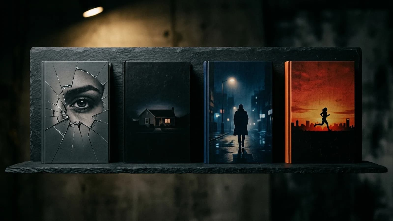
The anchor is a face, or part of a face, or a reflection of a face. Cracked mirrors, partial profiles, single eyes behind broken glass, distorted reflections in water. The palette tends muted, like dusty greys and washed-out blues, with occasional flashes of red. The mood is questioning sanity. The typography is often slightly less aggressive than other thriller sub-genres because the menace is interior, not physical. Real examples in this lane: "Gone Girl," "The Woman in the Window," "Behind Closed Doors."
Domestic thriller
The anchor is a house, a window, a familiar suburban silhouette that has been made wrong. A perfect picket fence under a black sky. A two-story colonial with one warm window and the rest of the house in shadow. A swing set in an empty backyard at dusk. The palette is more varied here, sometimes warmer to evoke the false safety of domestic spaces. The contrast between the warmth and the wrongness is the emotional engine. Real examples: "Big Little Lies," "The Couple Next Door," "The Wife Between Us."
Mystery thriller and crime noir
The anchor is the city. Rain-slicked streets under a single streetlamp, the silhouette of a detective walking away under a deep blue sky, a single window glowing in a tall building. The palette is the deepest blue-black on this list, with occasional cold neon accents (a single red sign across the street). Real examples: most of the Tana French covers, "The Girl on the Train," the Michael Connelly Bosch series.
Crime thriller (action lane)
The anchor is movement. A running silhouette, a single tail-light streaking across a dark background, a figure mid-stride against a sunset cityscape. The palette pushes warmer here, with reds, oranges, and dark blues bleeding into each other. Typography is often italicized or set at an angle to imply motion. Real examples: most of the Lee Child Jack Reacher series, the Mick Herron Slow Horses covers, James Patterson's high-octane paperbacks.
Sub-genre quick decision tree
- Is the threat coming from inside someone\'s head? Psychological thriller. Use a face or a reflection.
- Is the threat coming from inside the home or marriage? Domestic thriller. Use a house or warm-window-in-dark-house.
- Is the threat coming from the city or the system? Crime noir. Use a wet-street silhouette under a streetlamp.
- Is the threat physical, immediate, and fast? Action thriller. Use a running figure or a vehicle in motion.
Figure vs object: the cover anatomy decision
Every thriller cover has to choose between two anchor types: a figure (silhouette, partial face, figure in a setting) or an object (a single knife, a single key, a single envelope, a single phone). The choice changes how the cover communicates.
Figures invite the reader into a character relationship before they read a word. The reader looks at the silhouette and starts to wonder who this person is, what they did, what was done to them. Figures are the natural choice for psychological and domestic thrillers, where the entire plot revolves around character interiority.
Objects, by contrast, anchor the reader in a clue or a McGuffin. A single object on a dark field reads as evidence. The reader looks at the object and starts to wonder what it means, who it belongs to, what crime it implies. Objects are the natural choice for procedural mysteries, legal thrillers, and any plot where the engine is a specific item: a missing letter, a stolen photograph, a weapon with a backstory.
The mistake authors make is choosing the wrong anchor for the wrong plot. A psychological thriller with a knife on the cover signals slasher horror, not psychological menace. A procedural mystery with a moody silhouette signals character study, not detective puzzle. Match the anchor to the engine of the book.
Urban vs rural settings
Setting on a thriller cover is not decoration. It is genre signaling. Urban thriller covers use city silhouettes, tall buildings, rain-slicked streets, neon, and crowds. Rural thriller covers use isolated houses, empty fields, single trees, long horizons, and silence. The reader pattern-matches on setting before they read the title.
Urban setting cover code:
- Tall buildings as scale anchors in the background.
- Wet streets reflecting light, signalling night and rain.
- Single streetlamp or neon sign as the source of light.
- Bridges, fire escapes, alleyways as compositional elements.
- Cooler color temperatures, deep blues and steel greys.
Rural setting cover code:
- A single isolated house or farmhouse, often with a single warm window.
- Long, low horizons under heavy skies.
- Bare trees, fields, fences, dirt roads.
- Natural light sources: moon, dusk, single porch light.
- Slightly warmer color temperatures, with rust, ochre, and forest green as accents.
Six described thriller cover patterns
Below are six thriller cover patterns described in enough detail to mock up or use as a reference brief. Each one is the shape of a recurring bestseller pattern in its sub-genre.
Cover 1: Psychological thriller, fractured mirror
Charcoal-grey background. A jagged crack runs across the cover from upper-left to lower-right. Through the crack, half of a woman's eye is visible. The rest of the figure is hidden behind the unbroken mirror. Title in heavy white sans-serif across the top third, all caps, tight tracking. Author name in the same font at the bottom, smaller. No other element. The cover whispers that someone is looking back, and they should not be.
Cover 2: Domestic thriller, warm window in a dark house
Black background. A silhouette of a two-story suburban house occupies the lower third, slightly off-center. One single window glows warm amber. All the other windows are black. A single line of suburban fence runs across the bottom edge. Title in heavy white sans-serif at the top, two lines. Author name below the house silhouette, smaller. The cover sells the lie of a safe neighborhood.
Cover 3: Crime noir, wet street and lone figure
Deep blue-black background. A wet, reflective street fills the lower half, with a single streetlamp glowing at the back of the frame. A figure in a long coat walks away from the viewer down the center of the street, silhouetted against the lamp. Title in condensed all-caps along the top edge, set in white with a slight red glow. Author name at the bottom in the same font, smaller. The cover smells like rain.
Cover 4: Action thriller, runner against sunset
Black cityscape silhouetted across the lower third. A red-orange sky behind it, like a sunset or a fire. A single figure runs across the rooftops, silhouetted black against the orange. Title in heavy italic sans-serif slashing across the upper half, set in white. Author name at the bottom in the same italic, smaller. The cover is in motion.
Cover 5: Legal thriller, single object on dark wood
A dark mahogany wood-grain background. A single brass key sits in the center of the cover, lit by a hard rectangular shaft of light from the upper-left. Title in heavy navy serif across the top, set in restrained but commanding type. Author name at the bottom, in a smaller version of the same serif. The cover reads as a courtroom in low light.
Cover 6: Conspiracy thriller, multiple silhouettes
Charcoal background. Three silhouettes stand at staggered distances from the camera, each slightly smaller as they recede. The closest silhouette occupies the right third of the cover. The farthest is barely visible at upper-left. Hard white shafts of light fall vertically between them, suggesting surveillance camera light or interrogation lamps. Title in heavy condensed sans-serif at the bottom, set in white. Author name above the title, smaller, in the same font. The cover reads as a watched conversation.
The instant-recognition test
The single best test for a thriller cover is the instant-recognition test. It is brutal, fast, and tells you almost everything you need to know about whether the cover will convert at thumbnail.
Run it in four steps:
- Export your cover at 160 pixels wide. This is the exact size Amazon shows in search results on a phone.
- Convert it to grayscale. Strip out all color information. This isolates the underlying composition.
- View the grayscale thumbnail on a phone, not a desktop. The phone is where the decision happens.
- Squint slightly so the cover is mildly out of focus. Ask: does it still read as a thriller?
If the answer is yes, the bones are right. If the answer is no, color was carrying too much of the load and the underlying composition is too generic. Strengthen the silhouette, increase typography weight, or simplify the layout until grayscale-at-thumbnail still reads as thriller.
Reader expectations and when to break them strategically
The thriller cover conventions exist because they convert. Breaking them is expensive. But there are two specific situations where breaking conventions can be the right call.
When to push toward literary thriller territory
If your book is a slow-burn psychological or domestic thriller with crossover appeal to literary readers, you can soften the palette toward muted earth tones, replace heavy condensed type with a more elegant serif or a lighter sans-serif, and use a single-figure photograph rather than a silhouette. The risk is that hardcore thriller readers will not recognize the genre signal. The reward is that you may pull in book-club readers who skim past pure thriller covers. The recent generation of literary-thriller covers, from authors like Lisa Jewell, Liane Moriarty, and Karin Slaughter at the literary end, all do this.
When you have a celebrity author who can carry the cover
Stephen King's covers can break almost every thriller convention because the name alone is doing the conversion. If your author brand is strong enough that readers buy on the name, you have more freedom on the cover. For first-time authors and indie authors without name recognition, this freedom does not yet exist. Lock the conventions in until you have earned the right to break them.
Common thriller cover mistakes
1. Too literal
Showing the actual murder weapon, the actual body, or the actual crime scene reads as slasher horror, not thriller. The cover should imply, not depict. A shadow is scarier than a knife. A single drop of blood at the edge of a pristine kitchen is scarier than a kitchen full of blood. Restraint is the genre signal.
2. Warm or neutral palette
Orange sunsets on beaches, soft yellow living rooms, pink-and-cream bookshelves all read as romance, women's fiction, or literary novels. Unless you are deliberately pushing toward literary thriller, the palette has to lean cool, dark, and contrast-heavy. Warmth is the wrong signal for the thriller audience.
3. Thin or elegant typography
Light, refined serifs and thin sans-serifs read as literary or memoir, not thriller. The title typography has to feel like a slammed door, not a polite knock. If the title reads as elegant, the typography weight is wrong.
4. Cluttered composition
Three figures, two objects, a title, a subtitle, a tagline, a starburst, a blurb, and a series banner all on the same cover. The thriller cover survives by stripping itself to one anchor. Delete elements until what remains is unmistakable.
5. Faces at the wrong scale
A full clear face on a thriller cover reads as romance or literary fiction, not thriller. If you are using a face, it must be partial, in shadow, or reflected. The viewer should never see the whole face cleanly. The obscured face is what carries the menace.
Cover decisions for the print thriller
The print thriller cover has to extend the design across a back cover and a spine without diluting the front cover's punch. The conventions are tight:
- Back cover: single pull-quote blurb from a recognizable thriller author at the top, two-paragraph teaser blurb in the middle, three-line author bio at the bottom-left, ISBN block at the bottom-right. Keep the palette identical to the front.
- Spine: heavy condensed title vertical, author name at the bottom horizontal or stacked, optional series volume number at the top.
- Trim size: 5.25 x 8 inches or 5.5 x 8.5 inches for mass-market paperback, 6 x 9 inches for trade paperback or hardcover. Run the spine through our spine width calculator.
- Paper choice: matte lamination almost always wins for thrillers. Glossy reads as mass-market thriller from 1995, which is the wrong era signal for contemporary covers.
A/B testing thriller covers with Amazon ads
Thrillers are the single best category for A/B-testing covers via Amazon ad creative because the genre signal is so concentrated in the cover. Run two cover variants as Sponsored Product ad creative for two weeks, holding the bid and keyword set constant, and the click-through rate gap will tell you which cover survives the thumbnail downscale better. Spend $50 to $100 per variant and you have a real data signal.
Variants worth testing:
- Silhouette vs object anchor.
- Black vs navy base.
- Red accent vs white accent.
- Top-aligned title vs bottom-aligned title.
- Heavy condensed all-caps vs heavy condensed mixed-case.
Iterate thriller covers without a designer
KDPEasy ships thriller cover templates that hold the canonical palette, typography weight, and silhouette anchors out of the box. Swap variants in minutes and A/B test in days, not weeks.
Final thriller cover checklist
- One subject only. One silhouette, one object, or one heavy typographic anchor.
- Three colors or fewer, drawn from black, charcoal, navy, white, and crimson.
- Title in heavy condensed sans-serif. Tight tracking. Top or bottom alignment.
- Anchor element occupies at least 30 percent of cover height to survive thumbnail.
- Sub-genre signaling consistent: psychological uses faces, domestic uses houses, crime uses cities, action uses motion.
- No literal depiction of violence, weapons in use, or bodies. Restraint plus menace is the rule.
- No warm or pastel palette. The cover should not read as romance or literary fiction.
- Passes the instant-recognition test: legible and genre-correct at 160 pixels wide, in grayscale, with slightly unfocused eyes.
- Print edition uses matte lamination, locked back-cover layout, and consistent spine treatment.
- Cover system extends cleanly into a series if more books are planned.
Related articles
Frequently asked questions
Restraint plus menace. The cover shows one thing, lit from one direction, in a palette of three colors or fewer, and that one thing implies threat without depicting violence directly. A shadow on a wall, a half-visible figure in a doorway, a single red object on a black field. Thriller covers that try to show the murder, the weapon, or the body all fail because they remove the reader's imagination from the work. The reader's imagination is the entire point of the genre.
A silhouette removes facial features, which removes empathy. The brain cannot identify with a faceless figure, so the figure registers as threat by default. Silhouettes also do something specific at thumbnail size: they survive the brutal downscale from a 6 by 9 cover to 160 pixels wide. Facial detail vanishes at that size. A silhouette holds its shape. That is why almost every thriller bestseller at the top of Amazon search uses a silhouette in some form.
Black, charcoal, and a single accent of crimson red. Sometimes deep navy replaces black. Sometimes a hard white slashes across the dark fields. The palette is canonical because it does three things simultaneously: it signals genre at a single glance, it maximizes contrast for thumbnail legibility, and it carries the emotional code of danger that humans pattern-match instantly. Wider palettes scatter the message. Warmer palettes signal romance or literary fiction. The thriller palette is narrow on purpose.
Thrillers lead with tension. Mysteries lead with curiosity. Visually, thrillers tend to use heavier typography, harder shadows, and a more aggressive palette of black, charcoal, and red. Mysteries are softer, with more breathing room, often a single elegant object on a muted background, and warmer accent colors. A thriller cover wants you to feel your heart rate climb. A mystery cover wants you to feel a question form. Cozy mysteries push even further from thriller conventions, toward illustrated, almost cheerful covers that intentionally signal low-stakes amusement.
Heavier than you think. The title should be one of the loudest elements on the cover, in a condensed sans-serif or a heavy slab, set at high contrast against the background. Light or elegant fonts read as literary fiction, which signals a different reading experience to the thriller audience. Bold condensed grotesques like Druk, Knockout, Heroic Condensed, or heavier weights of Inter or Roboto Condensed all sit cleanly in the genre. Avoid scripts entirely. Avoid display serifs unless you are deliberately pushing toward literary thriller territory.
Figures for psychological and domestic thrillers. Objects for crime, legal, and high-concept thrillers. A figure, even a silhouette, invites the reader into a relationship with the character on the cover, which is the emotional engine of psychological and domestic thrillers. An object, like a single knife, a single key, a single envelope, works for thrillers where the plot revolves around a clue or a McGuffin. The wrong choice does not kill the cover, but the right choice multiplies its impact.
View the cover at 160 pixels wide, in grayscale, with your eyes slightly out of focus. If you can still tell it is a thriller, the cover is doing its job. If at that brutal size it could be mistaken for a literary novel, a romance, or a mystery, the cover has failed the recognition test. The test is essentially a check on whether your gross composition, contrast, and silhouette read as genre at a glance. Most failed thriller covers fail this test, not because of bad detail but because the bones of the design are wrong.
When you are publishing a domestic thriller that wants to signal a softer, more literary inflection, or when you are publishing a celebrity-author thriller where the name alone sells the book. The Lisa Jewell covers of the last several years use single-figure photography on muted backgrounds with elegant typography, which softens the thriller palette into literary thriller territory. The risk is that you will alienate hardcore thriller buyers who want the canonical palette. The reward is that you may pull in literary-fiction crossover readers. Make the call based on which audience you are targeting.
Match the actual setting of the book, then push toward genre conventions. Urban thrillers use cityscapes, rain-slicked streets, single streetlights, and tall buildings as scale anchors. Rural thrillers use isolated houses, empty fields, single trees, and long horizons. The trap is using a generic location, like an indistinct dark scene, which signals nothing. The reader buys a thriller largely on setting expectation, so the cover should specify the world it is selling.
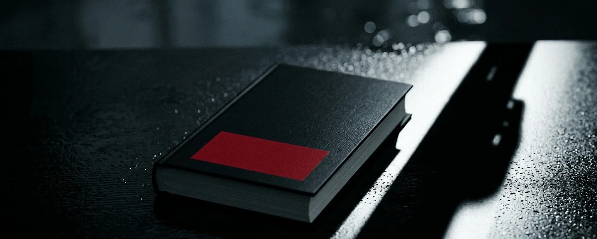
Dark enough that at thumbnail size the cover is mostly shadow with a single bright anchor of color, light, or contrast. Too dark is when nothing reads at thumbnail size because everything has collapsed into a black rectangle. The fix is always to introduce one element of high-contrast light or color, like the red rectangle in the hero image, the warm window of the lone house, the lit silhouette in the doorway. Pure darkness reads as nothing. Darkness plus one anchor reads as menace.
Yes for the moody, high-contrast styles that dominate the category. Modern image models are excellent at chiaroscuro lighting, silhouettes, and the red-black-charcoal palette. The risk is that they will reach for over-rendered or photorealistic violence if prompted carelessly. The thriller audience does not want explicit violence on the cover. Prompt for "implied menace, restrained, editorial book design, single anchor of red on charcoal" and the results stay in the genre lane.
Tighter than any other genre. Thriller readers buy a series largely on the visual brand of the lead author, and that brand is carried in a tight cover system: same title typography, same palette, same illustration style, often the same single recurring motif rotated per book. Lee Child's Reacher covers and Lisa Gardner's Detective D.D. Warren covers both lock the visual brand across dozens of books. For more on how to plan a thriller series cover system, see our deep dive on <a href="/blog/book-series-covers-cohesive-design">book series cohesion patterns</a>.

Written by Danielle Okonkwo
Marketing & Growth Lead at KDPEasy
Danielle is a published author with 12+ titles on Amazon KDP and a former book blogger. She writes KDPEasy's guides drawing from hands-on publishing experience and years of testing what actually works in the KDP marketplace.
View profile