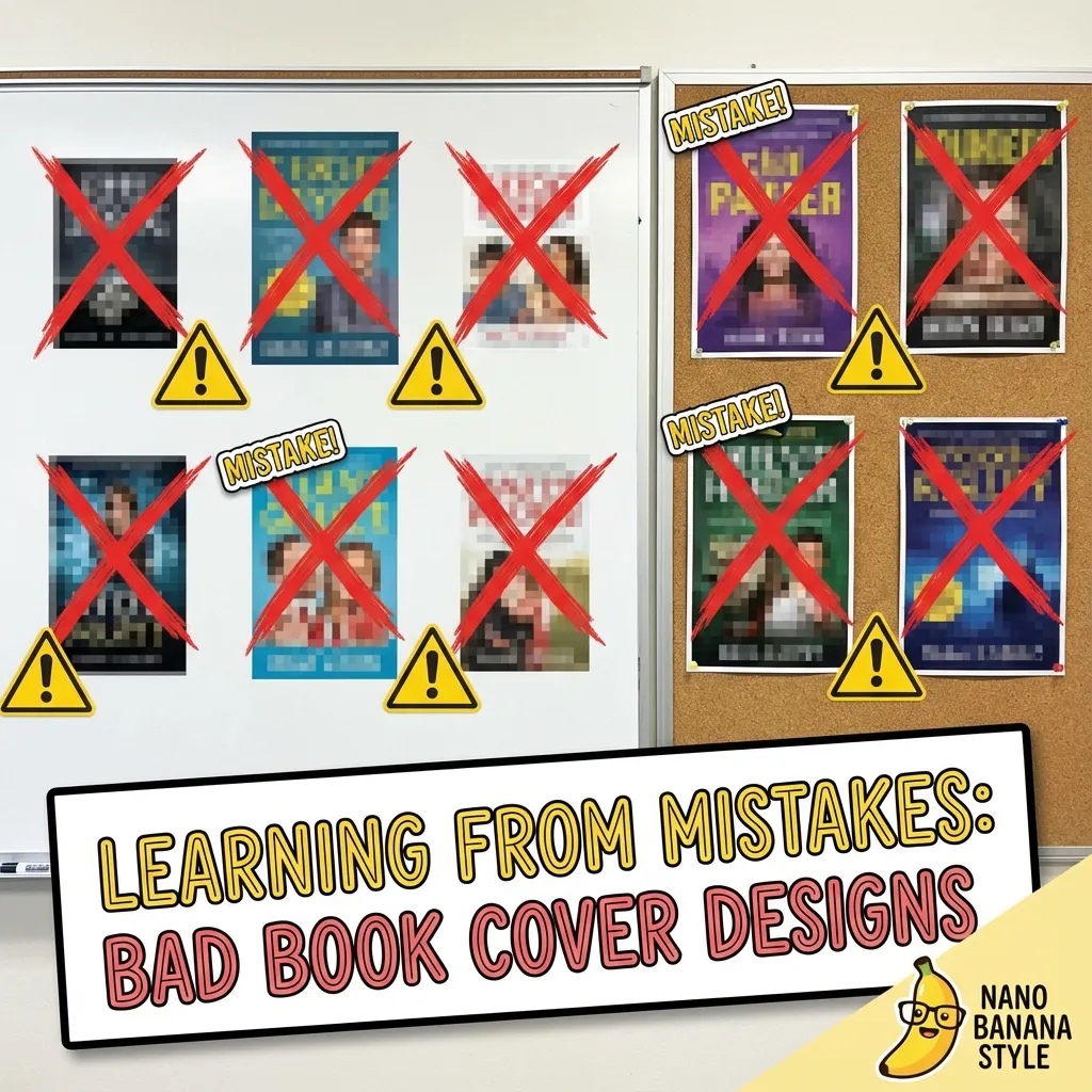
Your book cover is your #1 marketing tool on Amazon. These common book cover design mistakes cost self-published authors thousands in lost sales. Here are the 5 most common—and costly—book cover mistakes, and how to fix them.
Mistake #1: Unreadable Thumbnail Text
The most critical mistake: Your title can't be read at thumbnail size.
Why This Kills Sales
On Amazon, your cover appears as small as 160 pixels wide in search results. If potential readers can't read your title at that size, they scroll past. You've lost the sale in 2 seconds.
The Fix
- Test at thumbnail size: Shrink your cover to 160px wide. Can you read the title instantly? If not, increase font size or simplify.
- High contrast: Use colors that pop against the background. White text on light backgrounds is invisible at small sizes.
- Bold, simple fonts: Avoid thin, decorative, or script fonts for titles. Sans-serif fonts like Helvetica, Futura, or Montserrat work best.
- Limit words: Keep titles short and punchy. Long titles with small text get lost.
📊 Data Point
A study of Amazon bestsellers found that 92% have titles readable at thumbnail size. Among books with less than 100 reviews, only 34% pass the thumbnail test.
Mistake #2: Ignoring Genre Conventions
Every genre has visual expectations. Breaking these conventions confuses readers and tanks your click-through rate.
Why This Kills Sales
Readers browse genres they love. When they see a cover that doesn't "look right" for the category, they assume the content is also off-target—even if your book is perfect for them.
Examples of Genre Conventions
- Romance: Couples, embracing figures, script/elegant fonts, warm colors (red, pink, purple)
- Thriller: Dark colors, bold sans-serif fonts, mysterious imagery, high contrast
- Business: Clean design, professional fonts, blue/gray color schemes, minimalist layouts
- Fantasy: Epic landscapes, magical elements, elaborate typography, rich jewel tones
- Self-help: Bright colors (orange, yellow), clear benefit-driven titles, aspirational imagery
The Fix
- Research top 20 books in your category: Go to Amazon, search your genre, screenshot the bestsellers
- Identify patterns: What colors dominate? Font styles? Image types? Layouts?
- Match (don't copy): Use similar design language while making your cover unique
- A/B test if possible: Try different covers and track which drives more sales
It also pays to look beyond Amazon. Curated print and gallery sites like Framearto show how artists outside publishing handle palette and composition, giving you fresh visual cues to bring back into your genre.
Genre-Perfect Covers in Minutes
KDPEasy's AI understands genre conventions and creates covers that match reader expectations automatically.
Mistake #3: Low Resolution Images (Below 300 DPI)
Using low-resolution images is the fastest way to look unprofessional.
Why This Kills Sales
Amazon KDP requires 300 DPI minimum for print. Low-res covers:
- Get rejected by KDP during upload
- Look blurry and pixelated in print copies
- Signal "amateur" to readers, reducing trust and sales
- May pass automated checks but look terrible when printed
The Fix
- Always design at 300 DPI: Set your design software (Photoshop, Canva, etc.) to 300 DPI before starting
- Use high-quality stock photos: Download the highest resolution available from stock sites
- Avoid upscaling: Never take a 72 DPI image and "change" it to 300 DPI—this doesn't add detail, just bloats file size
- Check before upload: Open your final PDF in Photoshop or check properties to verify it's truly 300 DPI
Example Calculation
For a 6×9" book with 200 pages:
- Full cover width with spine and bleed: ~12.5"
- Height with bleed: ~9.25"
- At 300 DPI: 3750 × 2775 pixels minimum
Mistake #4: Cluttered Design with Too Many Elements
More is not better. Cluttered covers overwhelm readers and dilute your message.
Why This Kills Sales
Readers make snap judgments in 2-3 seconds. A cluttered cover:
- Confuses the eye—readers don't know where to look
- Looks amateur (professional designers use white space)
- Reduces legibility at thumbnail size
- Weakens your book's core message
Common Clutter Culprits
- Too many fonts (more than 2-3)
- Multiple competing images
- Excessive text (taglines, quotes, awards, long subtitles)
- Too many colors fighting for attention
- Overly complex backgrounds
The Fix
Follow the KISS principle: Keep It Simple, Stupid
- One hero image: Choose a single, powerful visual element
- Minimal text: Title, subtitle (if needed), author name. That's it.
- 2-3 fonts maximum: One for title, one for subtitle/author
- Limited color palette: 2-4 complementary colors
- White space is your friend: Empty space creates focus and professionalism
🎨 Design Rule of Thumb
If you can't describe your cover's message in 5 words or less, it's too complex. Simplify until the core idea is crystal clear.
Skip these mistakes entirely
Our AI book cover generator handles thumbnail legibility, genre conventions, 300 DPI, bleed, spine math, and CMYK output automatically. Upload your title and brief, get a print-ready file in 2 minutes.
Mistake #5: Wrong Trim Size for Your Genre
Choosing an unconventional trim size can make your book feel "off" to readers and increase printing costs.
Why This Kills Sales
Readers subconsciously expect certain sizes based on genre:
- Novels should feel like novels (5.5×8.5" or 6×9")
- Business books look professional at 6×9"
- Workbooks need space (8.5×11")
Using the wrong size:
- Makes your book look unprofessional
- Increases printing costs unnecessarily
- Can affect page count perception (too thin or too thick)
- May not fit standard bookshelves well
The Fix
Choose the right trim size for your genre:
- Fiction (novels, thrillers, romance): 5.5×8.5" or 6×9"
- Non-fiction (business, self-help, biography): 6×9"
- Technical books, textbooks: 7×10" or 8.5×11"
- Children's picture books: 8.5×8.5" square
- Cookbooks, photo books: 8.5×11"
Bonus Mistake: Not Testing on Real Devices
Always preview your cover on actual devices before finalizing:
- Desktop monitor: How does it look in search results?
- Mobile phone: Can you read it on a small screen? (Most Amazon shopping happens on mobile)
- Tablet: Does it stand out in grid view?
- Print proof: Order a physical proof copy—colors and details often look different in print vs. screen
The Bottom Line
Your book cover is not the place to cut corners. These 5 mistakes are easily avoidable with:
- Proper research (study your genre)
- Technical precision (300 DPI, correct trim size, readable fonts)
- Design simplicity (focus on one clear message)
- Professional tools (like KDPEasy)
Fix these mistakes and you'll immediately see better click-through rates, higher conversion, and more sales.
Avoid All These Mistakes Automatically
KDPEasy ensures 300 DPI, correct trim size, readable text, and genre-appropriate designs—all built in.

Written by Danielle Okonkwo
Marketing & Growth Lead at KDPEasy
Danielle is a published author with 12+ titles on Amazon KDP and a former book blogger. She writes KDPEasy's guides drawing from hands-on publishing experience and years of testing what actually works in the KDP marketplace.
View profile