A wraparound book cover is one composition split across three panels: back, spine, front. The covers that look professional are the ones that treat all three as one design, not three separate pages stitched together. This guide is the 2026 playbook for getting the wrap aesthetic right - continuous imagery, color flow, back-cover hierarchy, spine treatment, and the shelf-view perspective that separates indie paperbacks that look self-published from indie paperbacks that look published.
Why "front-only thinking" ruins wraparound covers
Most new authors design the front cover, then add the back and spine at the end as production tasks. That mental model is the single biggest reason indie paperbacks look amateur. A wraparound cover is not a front cover with appendages. It is one piece of artwork that happens to fold around a physical object.
Think of it like a billboard wrapped around a corner. The composition has to make sense when the book is laid open flat (designer view), when it is closed and held front-out (Amazon view), when it stands spine-out on a shelf (bookstore view), and when a reader picks it up and turns it over (back-cover view). All four perspectives. Same design.
The tips below assume you have already calculated your dimensions, spine width, and bleed. If you have not, the step-by-step full wrap cover tutorial covers the math. This guide is about the aesthetic, not the mechanics.
Tip 1: design the whole canvas, not three pages
The biggest mental shift is treating the entire file as a single canvas with one visual system. One type family. One palette. One mood. One lighting direction.
Workflow that produces cohesive wraparounds: design the front first to lock in palette and typography. Then carry those choices left into the spine and back. Every panel should feel like it came from the same designer, the same brief, the same day. If you have to switch font families or shift palette to make the back work, the front is wrong.
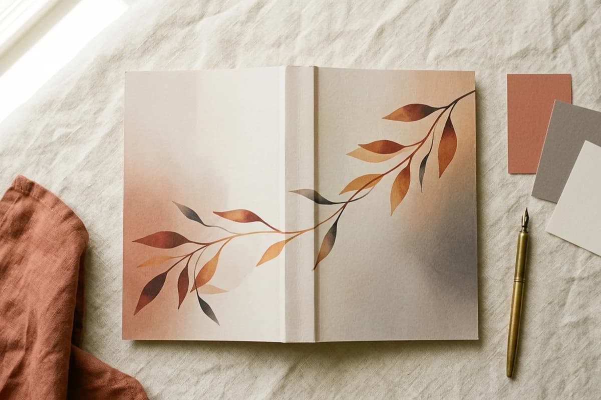
Tip 2: let imagery run continuously across the spine
Hard color breaks at the spine edges look amateur and amplify any printing drift. Let your background imagery flow across back, spine, and front as one continuous composition.
Even if your front has a hero illustration or photograph, the background texture, gradient, or color field should run all the way through. Three benefits:
- Hides minor binding misalignment during printing
- Reads as deliberate design rather than three pasted-together panels
- Makes the spine feel integrated rather than like a leftover strip
The forgiving design trick
Continuous backgrounds forgive printing tolerance. Hard stops at the spine punish it. KDP binding can drift up to 0.0625 inches in either direction. Design as if it always will.
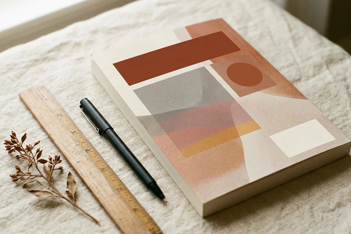
Tip 3: build color carry-through across all three panels
Color carry-through is the single biggest visual trick that separates pro wraparounds from amateur ones. Three colors do the heavy lifting:
- Dominant color - the color that defines the cover at thumbnail size. Usually the background or hero element on the front. Should appear on at least one spot on each of the three panels.
- Secondary color - supports the dominant. Pulls the back and spine together with the front. Often appears in typography or as an accent shape.
- Accent color - one small punctuating color. Often used for the title or a key graphic. Appears at the same point of emphasis on each panel where relevant.
Once those three colors are locked, every design decision on every panel pulls from that palette. No surprise colors. No off-palette photos. The cover starts to feel like a brand, not just a single book.
Tip 4: match spine background to its neighbors
The spine has to live next to two panels at once. Three options that work:
- Continuous artwork - background image runs through both spine edges into the front and back. Strongest visual integration.
- Sampled solid color - pick a color that exists in both the front and back panels and fill the spine with it. Reads clean and intentional.
- Bridge color - use the front's dominant accent color on the spine. Strongest shelf-view contrast.
What fails: a spine color that exists in neither panel. It instantly reads as a separate file inserted between the back and front, and breaks the wraparound illusion.
Tip 5: build a strict back-cover hierarchy
The back cover is half your conversion surface on a paperback. Buyers spend roughly three seconds on it before deciding. Use a strict hierarchy:
- Hook line at the top, 14 to 18 point, bold or italic. One sentence that creates intrigue. Not a tagline. A hook.
- Blurb, 11 to 13 point body type, 200 to 300 words. Three short paragraphs at most. Voice and stakes, not plot summary.
- Reviews or endorsements (optional), 10 to 11 point italic. One or two strong pull quotes with attribution. Skip if you do not have real ones - fake reviews damage trust faster than no reviews.
- Author bio with photo (optional), 10 to 11 point. Two or three sentences, third person, paired with a small portrait. Builds credibility for nonfiction more than fiction.
- Barcode space, bottom-right of the back panel. Clean 2 by 1.2 inch rectangle, approximately 0.25 inches from the bottom and right trim edges. Background only.
Less is more. A back cover with one strong hook, one tight blurb, and one endorsement outperforms a back cover packed with five paragraphs of synopsis, three quotes, a bio, a website URL, and a social media handle. Cut until it hurts.
Tip 6: treat the spine like a billboard
Your spine has to read from three feet away on a shelf. Three rules:
- Title only if spine is under 0.4 inches (roughly 150 to 175 pages or fewer depending on paper)
- Title plus author for spines 0.4 to 0.7 inches
- Title plus author plus small logo for spines 0.7 inches and up
Center text horizontally with at least 0.0625 inches of clearance from both spine edges. Use a bold or semi-bold weight that reads at distance. Skip decorative or thin fonts - they fall apart at small sizes and dissolve into mush on cream paper.
Spine text orientation in the US and UK reads top to bottom - rotate text 90 degrees clockwise so the head of the text sits at the top when the book stands upright. For the spine width formula, paper-type multipliers, and a 24-to-800 page chart, the KDP spine width formula guide covers everything.
Tip 7: the shelf-view perspective
Amazon trains us to think of book covers as front-only thumbnails. But every wraparound cover lives a second life on a physical shelf, spine-out, next to dozens of other books. This shelf-view perspective matters more than most indie authors realize.
Why it matters:
- Bookstore distribution. If you are pursuing physical retail, your spine is the only part the shelf ever shows.
- Library acquisitions. Library purchasers scan shelves spine-first.
- Author events. At signings and conventions your spine sits between dozens of others on the table or display rack.
- Visual identity. A strong spine signals a strong brand, which extends to ebook covers and ad creative.
Test it: mock up your cover at full size with the spine visible alongside spines of competing titles in your category. Three feet away. Does your spine read? Does it sit visually alongside competitors without looking like it was made by a different publisher? If yes, you have a real wraparound. If no, the spine needs more work.
Tip 8: test the front at 200 pixels wide
Amazon search results show your front cover at roughly 200 pixels wide. If the title is not legible at that size, you lose 90 percent of potential clicks. Before exporting:
- Export a JPG of just the front panel
- Resize to 200 pixels wide
- View from three feet away
If the title is readable: ship it. If not: enlarge the title type, simplify the hero artwork behind it, increase contrast, or pick a sturdier font weight. The same test applies on BookTok and Bookstagram, where thumbnails are often even smaller.
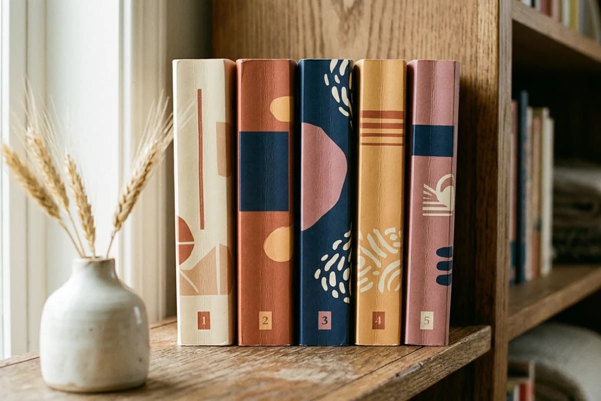
Tip 9: use genre conventions, then differentiate in execution
Buyers identify a book's genre in 0.4 seconds before reading a word. They are looking for visual cues:
- Romance: soft type, illustrated couples or dark silhouettes, palette signals subgenre (covered in the romance cover design guide)
- Thriller: high contrast, bold sans-serif, photographic imagery
- Cozy mystery: cute illustrations, friendly serif type, pastel palette
- Self-help: big bold title, minimal art, decisive color block
- Fantasy: ornate type, atmospheric art, rich color depth
- Literary fiction: minimalist composition, restrained palette, generous negative space
Match the genre's visual language first. Differentiate in execution - your specific colors, type pairing, hero art, photographic style - not in radically reinventing what the genre looks like. The successful indie authors follow conventions ruthlessly and innovate only in the details.
Tip 10: pick fonts that survive printing
Display type that looks crisp on a 27 inch monitor can dissolve into mush at 4 point on a printed paperback. Safe choices:
- Headlines: bold geometric sans-serif (Montserrat, Poppins, Inter Display) or modern serif (Playfair Display, Cormorant, Lora Display)
- Subheads: medium-weight sans-serif (Inter, Source Sans Pro, Open Sans)
- Body text on the back cover: humanist sans-serif (Inter, Source Sans, Roboto) or transitional serif (Merriweather, Lora, Crimson)
- Avoid: ultra-thin weights (under 300), decorative scripts at small sizes, anything you cannot read at 8 point
Two-font systems read more polished than three or four. Pick a display font for the title and one supporting font that handles the author name, back-cover body, and spine. Use weight and size to differentiate within the family.
Generate a wraparound that already follows these rules
KDPEasy builds wraparound covers from three inputs - trim, page count, paper type. Bleed, spine width, safe zones, barcode rectangle, and color flow are already correct. Print-ready PDF in under 5 minutes.
Tip 11: reserve barcode space - even if you have an ISBN
KDP overlays its own EAN barcode on every print book regardless of whether you provided an ISBN. Two stacked barcodes equals rejection. Always leave a clean 2 by 1.2 inch rectangle in the bottom-right of the back panel, approximately 0.25 inches from the bottom and right trim edges. Plain background, no text, no graphics, no fine pattern.
The classic mistake
Designers often place a beautiful flourish or pattern in the bottom-right of the back cover, then KDP's barcode lands on top of it and turns into visual noise. Always design the back-cover layout with the barcode rectangle drawn in as a placeholder, then build everything else around it.
Tip 12: build for 0.0625 inch printing tolerance
KDP's binding tolerance is plus or minus 0.0625 inches - about one sixteenth of an inch. That means anything within 0.0625 inches of a trim edge could end up trimmed off or shifted onto the wrong panel. Practical implications:
- Spine text stays 0.0625 inches inside both spine edges
- Critical visual elements (title, author, faces, hero graphics) stay 0.125 inches inside every trim edge
- Background artwork bleeds 0.125 inches past trim edges
- Do not place fine details (thin lines, small text, intricate ornament) within 0.0625 inches of any panel edge
- The barcode rectangle sits at least 0.25 inches from the bottom and right trim edges of the back panel
Tip 13: design in RGB, expect CMYK shift
You will see arguments online about RGB versus CMYK for KDP. The reality is simple:
- Design in RGB. KDP accepts both formats and converts to CMYK during printing.
- Avoid 100 percent pure colors (true black 000000, true red FF0000, true green 00FF00, true blue 0000FF). They shift unpredictably during conversion. Use 95 percent versions instead.
- Expect printed colors to look 5 to 15 percent darker than they do on screen, especially in shadow areas.
- Order a proof copy for any book you expect to sell well. The proof tells you what the reader actually receives.
Tip 14: export with embedded fonts and no security
The boring final step that breaks 30 percent of first-time uploads. Your export checklist:
- Single-page PDF (not a multi-page document)
- 300 DPI flat, full bleed canvas
- All fonts embedded or outlined
- Transparency flattened
- No password, no encryption, no security
- Under 40 MB total file size
If your tool offers an option to outline all text before export, use it. Outlining converts fonts into vector shapes so they can never go missing. The downside is the file becomes uneditable as text, so save the editable version separately.
Tip 15: get the proof copy before launch
Screens lie. The previewer in KDP shows you what the file looks like, not what the printer will produce. For any book you expect to sell well, order a proof copy (5 to 10 dollars plus shipping) before approving the cover for sale. Things you can only catch in print:
- Spine text positioned slightly off-center after real-world binding
- Colors that print darker than they appeared on screen
- Fine details that dissolve at print resolution despite looking fine in the PDF
- Paper-color shift on cream paper that changes how your design reads
- Texture and finish of the cover stock affecting perceived contrast
Authors who skip the proof copy are gambling that their PDF is exactly right. Authors who order the proof know it is exactly right before any reader receives a copy.
Common visual mistakes (and the fixes)
Mistake 1: spine looks like a leftover strip
Cause: spine designed as an afterthought after the front and back are finalized. Fix: redesign with continuous background imagery flowing through the spine, or pull the spine background from a color that already exists on both neighboring panels.
Mistake 2: back cover reads like a Word document
Cause: blurb text drops into the back panel without typographic hierarchy. Fix: apply the five-element back-cover hierarchy (hook, blurb, reviews, bio, barcode), use a font family that matches the front cover, and add at least one visual element (a small graphic, a color block, an accent line) that ties it back to the front.
Mistake 3: title invisible at thumbnail
Cause: title too small, too thin, or low contrast against the background. Fix: enlarge to at least 18 percent of front-cover height, use a sturdy weight (medium or heavier), and add a backing color block, knockout shape, or drop shadow if contrast against the background is weak.
Mistake 4: barcode lands on artwork
Cause: designed without reserving the bottom-right back-panel rectangle. Fix: place a placeholder rectangle at 2 by 1.2 inches in the bottom-right of the back, 0.25 inches from the bottom and right trim edges. Design everything else around it.
Mistake 5: stretched ebook image as wraparound
Cause: trying to reuse the ebook cover by scaling it horizontally to fill the wraparound canvas. Fix: design the wraparound as a new file. Use the ebook cover as the front panel, then build the back and spine as separate but visually integrated panels.
Mistake 6: hard color stops at the spine
Cause: front and back filled with different solid colors that meet abruptly at the spine. Fix: introduce a gradient transition through the spine, use a continuous background image, or reserve a single bridge color that runs through the spine and appears on both flanking panels.
The shortcut version
If you only remember three things from this guide:
- One composition, three panels. Not three designs.
- Test at thumbnail size and at shelf size. If the title does not read at 200 pixels wide or the spine does not read from three feet away, redesign.
- Reserve the barcode rectangle. Bottom-right of the back panel, 2 by 1.2 inches, clean background, 0.25 inches in from the bottom and right trim edges.
Get those right and your wraparound cover will look professional. The rest is execution, and execution compounds with each book you publish.
Wraparound covers without the manual work
KDPEasy generates wraparound covers from trim size, page count, and paper type. Front, spine, back, bleed, safe zones, and barcode space all calculated automatically. Print-ready PDF, ready for KDP upload.
For the underlying mechanics - exact dimensions, spine math, bleed calculations, and rejection causes - see the step-by-step full wrap cover tutorial. For the spine width chart across every paper type and page count, the KDP spine width formula guide is a quick reference. To skip the math entirely, the KDP cover size calculator returns total width, total height, and spine width from your three inputs.
Related articles
Frequently asked questions
A wraparound book cover is a single continuous artwork that wraps around the entire physical book - back cover, spine, and front cover - delivered as one print-ready PDF. KDP requires this format for every paperback and hardcover. The artwork must be designed to read as one composition split across three panels, not three separate designs glued together.
In almost every case, yes. Continuous imagery across back, spine, and front looks more professional, signals deliberate design, and forgives small printing alignment errors during binding. Hard color stops at the spine edges amplify any drift and read as amateur. Even when the front has a distinct hero image, the background gradient or texture should flow uninterrupted across all three panels.
A strict five-element hierarchy in this order: one-line hook at the top, 200 to 300 word blurb, optional reviews or endorsements, optional author bio with photo, and a clean 2 by 1.2 inch barcode rectangle in the bottom-right. Less is more. A back cover with one strong hook, one tight blurb, and one quote will outperform a back cover crammed with everything you wanted to say.
Three rules. First, only place text on the spine if your book has 79 or more pages (KDP requires the spine be blank below that threshold). Second, keep spine text 0.0625 inches inside both spine edges to absorb printing tolerance. Third, scale font size to spine width: 8 to 10 point for thin spines, 10 to 14 point for medium, 14 to 18 point for thick. Bold weights only - thin or decorative fonts dissolve at small sizes.
They are the same thing. "Wraparound," "full wrap," and "print cover PDF" all refer to the single PDF that contains the back, spine, and front of a printed book in one continuous file. The terms get used interchangeably across KDP documentation, design tutorials, and author forums. Treat them as synonyms.
Eye-level photograph or mockup of your book standing spine-out on a shelf next to competing titles in the same category. If your spine does not read from three feet away or it sits visually awkwardly next to its neighbors, the cover fails the shelf view test. This matters for any author doing bookstore distribution, library outreach, or events, and it is also a strong predictor of how the cover will perform in Amazon thumbnail mode.
Reserve a clean 2 by 1.2 inch rectangle in the bottom-right of the back panel, approximately 0.25 inches from the bottom and right trim edges. KDP overlays its own EAN barcode there automatically, regardless of whether you provided an ISBN. Background only inside the rectangle - no text, no graphics, no fine pattern. Many designers add a placeholder rectangle during layout so they never lose track of where it sits.
Designing the front first, the back as an afterthought, and the spine as a filler strip. A wraparound is one composition. Treat all three panels as a single canvas: pick one palette, one type system, one visual mood, and apply it across the entire layout. Backs that look like Word documents and spines that look like leftover space are the dead giveaway of a self-published paperback that did not get the wrap right.
KDP requires 0.125 inches of bleed past every outer trim edge, and a 0.125 inch safe zone inside every trim edge for critical text and graphics. That gives you a 0.25 inch buffer total per outer edge. For the spine, keep all text at least 0.0625 inches inside both spine edges - printing tolerance is plus or minus 0.0625 inches and anything closer can wrap onto the front or back panel during binding.
Design in RGB. KDP accepts both formats and converts to CMYK during printing. Designing natively in CMYK locks you out of brighter colors that RGB supports. Two caveats: avoid 100 percent pure colors (true black, true red, true green, true blue) because they shift unpredictably in conversion, and expect printed colors to look 5 to 15 percent darker than they do on screen. Order a proof copy for any book you expect to sell well.
You can reuse the front, but you cannot just stretch the ebook image into a wraparound. The ebook cover is a single 1600 by 2560 pixel JPG. The wraparound is a print-ready PDF at 300 DPI with calculated total width, spine width, and bleed. Use the ebook cover as the front panel of the wraparound, then design the back and spine separately as part of one unified composition.

Written by Danielle Okonkwo
Marketing & Growth Lead at KDPEasy
Danielle is a published author with 12+ titles on Amazon KDP and a former book blogger. She writes KDPEasy's guides drawing from hands-on publishing experience and years of testing what actually works in the KDP marketplace.
View profile